

Journalism is hardly the field you think of when it comes to data visualization. But on closer inspection, you may be surprised to find that they are visualization experts.
Each week, thousands of newspapers, magazines, and other publications publish pieces not only to express information but do it in a manner to try and capture a reader’s attention.
Therefore, it’s not surprising that they’d try to leverage visualizations, even if they’re not perfect.
They also do not necessarily have some of the advantages I was used to as a UX Designer. With tight budgets and strict deadlines, they can’t necessarily seek out users for testing; thus, they’re often required to come up with visualizations that serve the general public as best that they can.
But there’s another, more important reason that we should look to journalists for guidance: they are experts at telling stories based on data.
As a result, it’s of little surprise that one of the famous data visualizers of the modern era, Alberto Cairo, is both a journalist and a designer.
But there are some critical differences between a field like Data Science and a domain like Journalism, and it touches upon a long-standing battle within the visualization community. So let’s discuss this change as it pertains to the visualization wheel.
The visualization wheel and two viewpoints
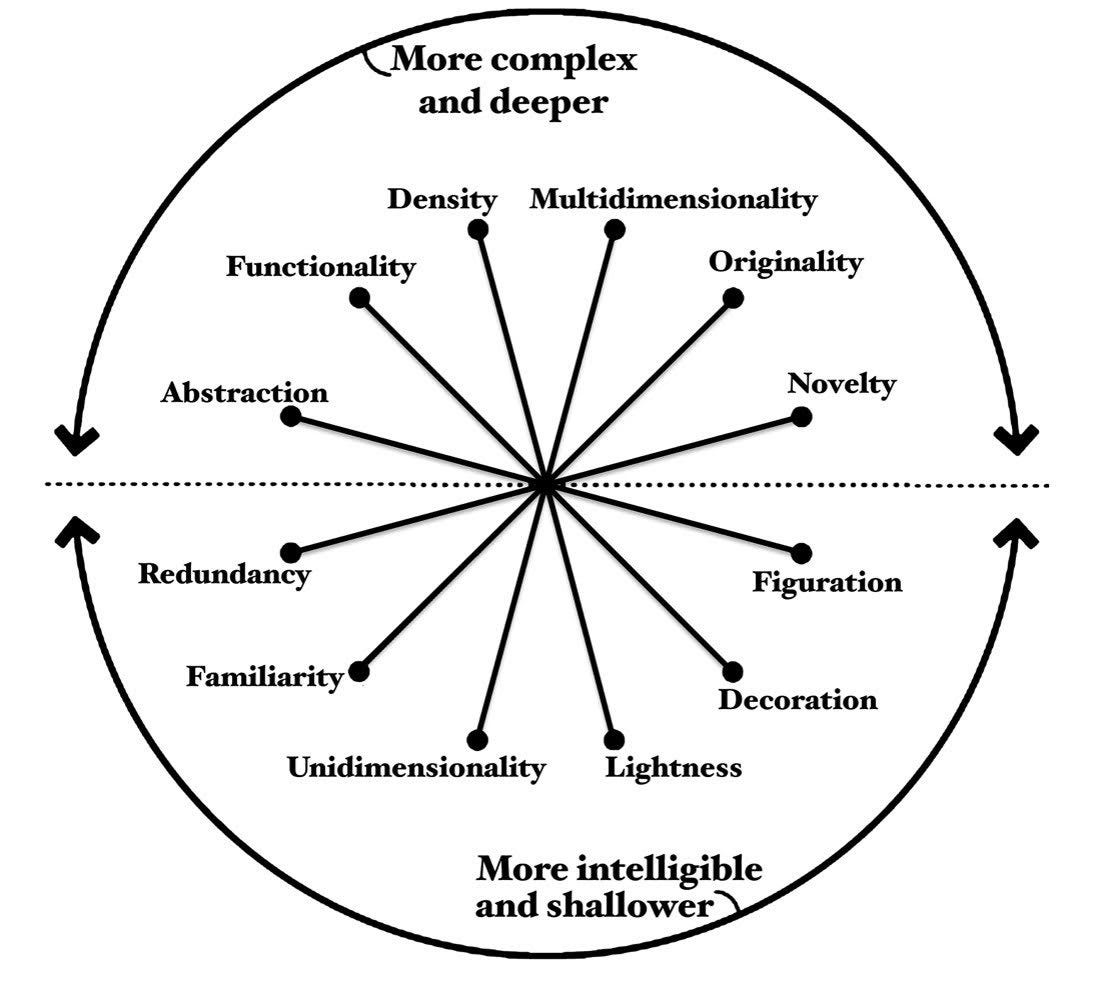
To try and plan visualizations, Alberto Cairo created something called the visualization wheel. This came about because his editors didn’t like the visualization he had made, but couldn’t describe it in helpful terms: they used words like it being too ugly and too complex.
As a result, he came up with this wheel that consists of 6 pairs of dimensions that visualization can classify.
I won’t go into too much detail here, but the dimensions are:
● Abstraction-figuration: Is the visualization more abstract and conceptual, or is it more realistic?
● Functionality-Decoration: Are there visual elements that do not aid in comprehending the visualization?
● Density-Lightness: How much information is provided in the graphic?
● Multidimensionality-Unidimensionality: Are there many layers of depth in the visualization or just one?
● Originality-Familiarity: Is this visualization something new to audiences or something they know?
● Novelty-Redundancy: Are you explaining many things once or one thing multiple times?
Choosing the first option moves you closer to the top of the wheel, where visualizations are deeper but more complex. Selecting the second option moves you closer to the bottom, where visualizations tend to be more intelligible but shallower.
And while classifying points on the scale is often a subjective measure, Journalists tend to favor a different type of visualization wheel than Data Scientists:
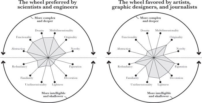
Cairo highlights these differences of trying to visualize something which draws its’ roots from Edward Tufte and Nigel Holmes. Tufte’s viewpoint comes from academia and is what many data scientists and engineers may subscribe to, which is to present complex data in the most efficient way possible.
Tufte expands on this idea with what he calls the Data-ink ratio: This is a measure of the total ‘ink’ that data is encoded in, divided by the whole ‘ink’ needed to print the graphic. Simply put, this seeks to remove anything that is not strictly required to present the data: this can include things such as axis, graph lines, or other things like that. In this manner, more complex ideas can be presented at a deeper level if done correctly.
On the other hand, Nigel Holmes was an art director for Time Magazine and took an approach that aligns with many artists, journalists, and graphic designers. They take the path of accentuating data with additional graphics, embellishments, or other markers that may seem redundant from an efficiency perspective. As a result, the visualizations are more intelligible and can make sense to a greater audience, even if the message is shallower.
Given that I’m a relative novice in this field, I don’t plan to argue for one side or the other. But from an outsider’s perspective, it seemed best to learn both sides: Data Science taught me crucial lessons when it came to structuring data, finding your metrics of interest, and creating user testing with metrics in mind.
But as I discussed earlier, I’m not a big fan of merely relying on the reader to decode the data that I’ve encoded. The human mind is not the same as a standardized piece of technology, which means that people can interpret visualizations differently.
So it seems like by learning the Journalist’s approach, I could learn the basics of presenting to a general audience. Even if they aren’t perfect, these visualziations often express simple points so those general audiences can understand them.
If we can learn how to do this, then revisiting a number of the Data Science lessons at a later date can help us understand how to create more complex visualizations and more difficult topics.
So how do journalists create visualizations? To learn that, let’s look at Alberto Cairo’s process.
How Journalists create visualizations
In the Functional Art, Alberto Cairo talks about his process for creating effective visualizations on a weekly basis working with his team at Epoca magazine:
1. Define the focus of the graphic, what story you want to tell, and the key points to be made. Have a clear idea of how the infographic will be useful to your readers, and what they will be able to accomplish with it.
2. Gather as much information as you can about the topic you are covering. Interview sources, look for datasets, and write or storyboard ideas in quick form.
3. Choose the best graphic form. What shapes should your data adopt? What kind of charts, maps, and diagrams will best fit the goals you set in the first step?
4. Complete your research. Flesh out your sketches and storyboards.
5. Think about the visual style. Choose typefaces, color palettes, etc.
6. If you’ve been sketching offline, move the design to the computer. Complete the graphic using the appropriate software tool.
We can see that a lot of this process occurs before even touching a tool to create a visualization: this is a point that Cairo makes in his book as well. It’s very tempting, in this age of powerful graphical tools, to immediately start building a visualization based on whatever data and basic ideas that you have. However, to create a great visualization, you have to understand the story that you want to tell first: without that, you can create a stunning visualization that doesn’t really teach your audience anything.
So we will use this framework for how we will approach this next section. I will take an idea that you might have gotten from your data, and walk you through the process to try and understand how journalists may turn a pattern in your data into a visualization that tells a story.