Why are we not thinking of Data Visualization as a design pattern?
Design documentation to help you use data visualization in your designs.

I recently had a chance to revisit Data Visualizations as I’ve started using them more in my design projects.
We often don’t think of Data Visualization as a design pattern. However, when you work on complex websites or mobile applications, it can be a valuable tool to help simplify and clarify data.
However, Data Visualization is often not described from a design perspective: most documentation is created for Developers or Data Scientists. So it can be tricky for designers to understand exactly how to use them.
That was the case when I wanted to learn Data Visualization for Designers. I’ve since written two books on the subject (link) to help address that, and here’s how I would document Data Visualizations to use as part of any design system.
Data Visualizations are about simplifying and clarifying data
Data Visualization is an entirely different field I’ve spent two books exploring, so I won’t go too deep into the specifics.
Instead, I’ll talk about the process at the core of Data Visualization and User Research: the DIKW model. The idea behind this is that data needs to be refined to turn into the most valuable insights at the top of the model.

You might be familiar with this process from your user research. For example, you wouldn’t present raw interview transcripts and notes to your team (Data). Instead, you organize that data into structured Information, then analyze that Information to turn that into Knowledge (and Wisdom) that you present to your team.
Good data visualizations follow that process, except you turn it into a visualization rather than a PowerPoint presentation. Bad Data Visualizations, on the other hand, visualize “Data” or “Information” only, which doesn’t tell the reader much.
However, a Data visualization can’t fit as much Information as an entire Powerpoint presentation. So instead, you have to focus on one clear message.
Data Visualizations should have one primary message
The most common way that people mess up Data Visualizations is by trying to cram too much into them.
Data Visualization should have one primary message that is clear to whoever is reading it. That’s because, unlike a PowerPoint presentation, people might view your data visualization without you explaining what it means.
So to figure out what message you want to show, you should ask three questions:
Who is your targeted reader?
What do you want them to know or do?
How can data help you make this point?
So, for example, if you want your users to see that using your product results in 65% fewer errors, then your data visualization should focus on changes over time, precisely when someone started using your product.
With that in mind, let’s talk about use cases.
Use cases for data visualization
Since data visualization is primarily used for simplifying and clarifying data, its primary use case is when there is likely too much or too complex data to present to users.
Data visualizations, in many cases, are a clear alternative to tables, large blocks of text, or certain types of data (such as geolocation data).
Another use case comes when the scale of data is enormous. For example, if you’re trying to show basic Information for hundreds or thousands of devices, it can be a better alternative than infinite scroll.
Lastly, the third use case is space-saving, which is often the case for mobile applications. For example, you might need more room to explain something in detail on mobile, so many mobile applications use visualizations to help condense their message.
However, those aren’t the only use cases. In the past, I’ve used data visualizations in my designs to show the following:
Basic statuses of thousands of devices
How a product has resulted in changes over time
Diagnostic errors in dashboards for network monitoring
Explanations of where geolocated data is coming from
How reductions in medical order variance correlate with patient quality
Etc.
The main thing to remember is that we can use them to reduce complexity and scale visually.
With that in mind, let’s look at the components of Data visualization.
Data Visualization Components
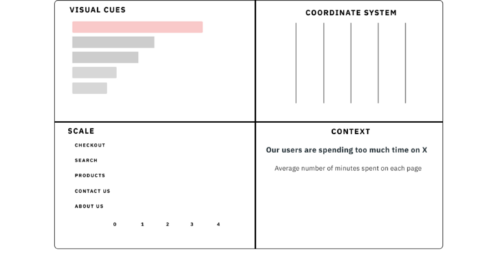
According to Nathan Yau’s Data Points: Visualization that means something, four elements make up any Data Visualization: visual cues, a coordinate system, scale, and context.
Here’s what you need to understand about each component:
Visual cues: these are the primary way your charts change from one Data Visualization to another. Specific visual cues are considered easier or harder for people to perceive accurately, so keep this in mind as you choose a chart.
Coordinate system: This is mainly the difference between using most charts and special ones like pie and donut charts. Given that pie charts should most likely not be used, you shouldn’t need to worry about this.
Scale: These markings will help define what these visual cues will mean. Users will reference the data categories and markings to decipher the visualization’s meaning.
There are two main things to know about this component:
Always start your charts at 0 (There are exceptions, but this is a general rule of thumb)
Make sure the scale matches your data (Don’t make your scale too gigantic or small)
Context: While visuals can help provide a lot of explanations, they can’t explain everything. You would pair these additional explanations with your chart (such as titles, subtitles, and more) to elaborate further on your point.
However, this might not answer your primary question: what sort of Data Visualization do I use?
Common types of Data Visualizations
While there tends to be a whole range of potential Data Visualizations that you might use as a Data Visualizer, if you’re using this for design purposes, there tend only to be 4–5 charts you’ll use regularly.
Simple numbers: Emphasizing a number with some additional context
Bar charts: Using length as a visual cue to compare different values
Line charts: Talking about data changes over time
Slopegraph: Highlighting a specific category changing over time
Stacked Bar/Column chart: Highlighting multiple parts of a whole (like survey responses ranging from Strongly Disagree to Strongly Agree)
Pie charts, as a whole, should only be used in particular circumstances.
These charts will likely cover most of what you’ll need to use in your design, and figuring out which one to use is primarily based on figuring out what message you want to deliver.
However, there’s one other thing you should pay attention to the importance of pre-attentive attributes.
Pre-attentive attributes (Hierarchy, Color, and Shading)
Remember that part of presenting a Data Visualization is showcasing specific data that aligns with your primary message.
As a result, one of the things you need to consider is which data to emphasize and what to de-emphasize.
This is where pre-attentive attributes, or attributes that draw people’s eyes, come into play.
The three main ways of doing this are:
Information hierarchy, such as putting a bar at the top of the chart
Color, such as emphasizing one value and de-emphasizing others
Shading, emphasizing a range of values while de-emphasizing others
Consider Data Visualization as a way to reduce complexity.
For many projects, you might not need to use data visualization. Modern designs are often about using as few design elements (and data) as possible.
However, if you’re working in specific environments (like internal applications) with a ton of complexity, consider using Data Visualizations to simplify what users need to understand.
If you understand just a little bit about visualizing data, you can come up with elegant solutions to complex data problems.
Kai Wong is a Senior UX Designer and a top Design Writer on Medium. His new book, Data-informed UX Design, explains small changes you can make regarding data to improve your UX Design process.


