


What a quantitative user study that nearly failed taught me about metrics
The benefits to collecting metrics while user testing, even with a few users


Our team almost had to consider throwing out a portion of our quantitative user test because some of our users canceled on us.
We needed to look at Time-on-Task to answer one of our research questions. This meant we needed to have enough users to provide statistically significant comparisons.
We were able to scrape together 20 participants, the minimum recommended number for quantitative testing, but two of the participants fell through last minute. That meant we had to scramble to get more.
But during that process, I began to wonder: what if we had only managed to get 18 participants instead? Would we have had to throw out that metric entirely? Why wouldn’t that be useful?
I dug deeper into the subject as a result and learned three crucial things:
You need to change the way you do calculations with a smaller sample size
You can make use of small sample size data by changing the way you talk about it to your team
To avoid delving too far into statistics, let’s concentrate on that last point. It can be worth it to collect metrics, even if you have a small sample size.
But we first need to talk about one complex concept: Statistical significance.
Understanding statistical significance
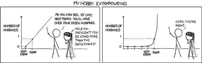
http://xkcdsw.com/2274
To understand what’s so bad about not having enough participants, let’s talk about an extreme example.
Let’s say your target audience consisted of two main user groups, middle-aged computer experts and novice senior citizens. Could you say that you had a valid time-on-task if you just timed Joe, a computer scientist, and his two colleagues? The answer is no, for two main reasons:
The users you’re testing aren’t representative of your user base
You don’t have enough users to account for noise.
The first reason should be self-explanatory. If you’re only testing with experts, of course, they’re going to perform better than novice senior citizens. You would also need to test someone like Martha, someone who just started learning the computer a year ago, to have a more representative user base.
However, testing with those four users would likely not be enough because of ‘noise’. The most straightforward way to explain it is this: imagine that you tested Joe at 10:30 AM, and he tested well. But then he and his colleagues went out to an all-you-can-eat Mexican buffet for lunch. So his colleagues are incredibly sleepy when it comes to afternoon testing.
If you average out the metrics based on these people, you might have a very high time on task. But it’s not because of your prototype: it’s because of these outside factors.
These factors are why users’ numbers (and demographics) matter so much when looking at metrics. Statistical significance is a sort of protection against randomness: it’s a way of trusting that the data is the truth instead of just random noise. So what happens if don’t have the recommended number of users to establish statistical significance?
At this point, we can do one of two things. We can use statistical methods to gain statistical significance with a small sample size. However, this may involve a deeper dive into statistics than many of us are used to. Or we avoid statistics entirely. We do this by looking at validated metrics and gathering proto-metrics during user testing.
Here’s how to do that.
How to use metrics while avoiding statistics
You may be sitting on a treasure trove of statistically significant data points and metrics that exist in Google Analytics. Having this data allows us to establish a baseline of metrics that we can reliably look at without worrying about statistics. We can make use of this with a framework called UX Optimization by Craig Tomlin. He advocates for a 4-step process combining Qualitative and Quantitative Research, which includes:
Building Personas
Looking at UX Behavioral Data (through Google Analytics)
Usability/User testing
Analysis/Recommendations
He advocates this process to get a snapshot of what’s going on with the current system before asking why. If you’re building personas around 60-year-old computer novices, it’s helpful to see how that user group uses your current system.
Suppose you search for that specific demographic on Google Analytics and find metrics that state they spend an average of 15 minutes on a page. In that case, that’s something that may drive the way you design your user testing and questions/prototypes. This method can also be useful for stakeholder alignment, especially in data-driven organizations.
Some fields, like Healthcare or Natural Science, are used to research with dozens if not hundreds of participants. As a result, conducting qualitative research as UX practitioners can sometimes be hard to get buy-in from your team.
This is where referring to a validated dataset from Google Analytics, which may contain thousands of users, can be helpful. If this data shows that there are problematic metrics, then investigating why this is the case is easier to sign off on. Even if they don’t understand why you’re only talking to 5–10 users, it’s easier to accept.
But in this case, why should we spend the time to collect metrics during user testing, especially if we only have a few users? The reason is simple: it’s to have a point of comparison. But this point of comparison needs a new name because you can’t treat it like a standard metric.
Proto-metrics vs. metrics
I want to coin a term, proto-metrics, to differentiate the metrics collected in these settings versus actual metrics. I’ll define proto-metrics as measurements collected quickly to quantify an individual user’s experience. I take that naming convention from the idea of proto-personas. Low UX maturity organizations often use a proto-persona to make a persona based on their assumptions and no research.
It is not as good as an actual persona, but it can be helpful if the organization wouldn’t invest in personas in the first place. The main benefit of proto-personas is getting your team to explicitly state their assumptions about the users.
A proto-metric serves a similar function. It is not as good as having statistically significant metrics, but collecting these metrics is helpful for two reasons:
It allows us to provide a quantitative layer to our data, which helps tell a story
It will enable us to make a preliminary comparison, which can be beneficial in exploring ideas further
But I specifically coined the term proto-metrics because you cannot treat them like metrics. Proto-metrics should only be used to report individual values, not aggregated statistics.
Something like“Average Time-on-Task” will be skewed if you’re testing with Joe and his friends. You’re also not going to be able to guarantee statistical significance. Other things that you cannot do with proto-metrics include:
Benchmarking (comparing scores to a previous benchmark)
Calculations (Averages, Sums, min/max quartiles, etc.)
Percentages (75% of users…)
If you have the budget to collect statistically significant metrics during user testing (with at least 20 users), then that’s great. But if you can’t, it may be useful to collect proto-metrics to serve as additional evidence.
Adding a quantitative layer to your data
You may already be using proto-metrics in your findings reports, as they are some of the best ways to convey the severity of a problem. We often do this with task success. Saying “1 out of 8 participants was able to complete this task” highlights how challenging a task may be.
Collecting proto-metrics allows you to extend this out to other data types, such as time on task. But remember, we can only talk about the individual in this case. For example:
“One participant really struggled with trying to find the product details page. She spent over 8 minutes searching through the sidebar menu for the name of our product, not realizing it was nested under a different heading.”
Collecting time-on-task allows us to quantify what “really struggled” means for this individual. However, we don’t have enough data to apply this to all our participants. That’s why we can’t say “Participants spent an average of 6 minutes and 15 seconds”. But looking at that validated Google Analytics dataset allows us to do something else.
Forming a preliminary comparison that drives further exploration
Google Analytics data allows us to get a snapshot of how users currently use the system. If any metrics stand out, we can dig with our user testing to understand why. But proto-metrics allow us to indicate how a usability issue and metric may be linked and require further exploration. For example:
“Based on Google Analytics, users spend an average time of 9 minutes on our product page trying to checkout. However, when we tested the page with users, 6 of them grew frustrated because they attempted to click on the company logo near the bottom (Shakeout). When we asked them about it, they were confusing it with a checkout button.
Four users spent more than 10 minutes on the page, with one spending 15 minutes. We believe that changing the layout of the product page will lessen the amount of time it takes for our users to complete this task.”
We often convince our stakeholders that certain things are problems because it goes against usability best practices. This is a fundamental part of creating a systematic and rigorous qualitative framework, but it simply may not be that convincing to specific team members.
This is where adding a quantitative layer to your data can help. One of the best examples of this (and also something that is surprisingly accurate with five users) is the System Usability Scale (SUS).
Collecting this metric doesn’t just allow you to see a number associated with usability: it also provides you with a different way of communicating usability issues to your team.
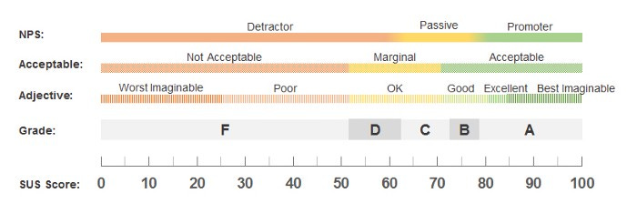
https://measuringu.com/interpret-sus-score/
Rather than saying something neutral like “We have a lot of usability issues, and some of them are quite severe.” The SUS score (and its’ interpretation) allows us to say something as powerful as:
“Our SUS score is 51, which means our usability rating is an F.”
Your team may have varying levels of knowledge regarding UX, but they’re all going to know what getting an “F” means (or even feels like). So this is an incredibly effective way to get people to pay attention to why the UX of the product is so bad.
Collecting UX metrics on a qualitative test
User testing can often be incredibly hectic, especially when you’re the one planning it, getting permissions, doing test runs, and more.
The thought of adding another step to your user test, especially one that might not provide valid data, might seem pointless.
However, there are two things that you should remember:
Most UX metrics are simple to collect
They can provide a quantitative layer to your data
For our study, adding time-on-task to it was incredibly easy. Our note-taking application timestamped each observation, so all we did was type “Start” and “End” when the users started and stopped the task to log the times, which we calculated later.
Most UX metrics are just as easy to collect. For example, writing “error” when users make errors, recording task success or failure, or adding a survey at the end of your testing aren’t high-effort actions.
But you can gain a whole lot of knowledge from doing so, even if you don’t have a statistically significant group of users.
Kai Wong is a UX Specialist, Author, and Data Visualization advocate. His latest book, Data Persuasion, talks about learning Data Visualization from a Designer’s perspective and how UX can benefit Data Visualization.