We misuse the term "user insight" a lot—here's how to actually use it
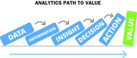
User insights are how we, as experts, recommend the best action to our team.
User insights are not easy to generate, but they're crucial to getting your team to take the right actions.
Understanding this and the problem with typical usability reports allowed me to make more meaningful design changes. The critical difference between generating user insights and presenting information comes from addressing your audience's needs.
You're not trying to tell your team everything that your users said or did. Instead, you should address what your decision-makers care about: what should we address (with our limited resources)?
What's more, you don't need to have a senior job title to do this. You need to realize one key thing: you're the expert on the data.
You are the expert on the data, so recommend something
When the presentation rolls around, it's likely that nobody else is as much of an expert on the data as you are. You might have run the tests and analyzed the data over weeks (or even months), which means you know the ins and outs of working with this data.
On the other hand, your decision-makers may only have some cursory knowledge of this dataset and may be relying on your presentation to help figure out what to do next. In other words, they might have about 20 minutes of experience with the data (i.e., whatever you present to them).
This familiarity imbalance is the reason that you need to be the one to recommend specific actions. Imagine a similar situation with a wine sommelier and a customer.
If all the wine sommelier did was list out what wines they had in stock without giving any recommendations or details, the customer would be forced to make a snap call on whatever sounded good, which might result in an unhappy customer (and a sommelier thinking "that was a terrible pairing" in the background).
However, the customer is still the one paying for the wine, just like your decision-maker is the one who makes the final call. So our job isn't to decide for them but to recommend specific actions and persuade them to follow through.
Some of you might think that this means hiding 25 of the 30 user findings to recommend 5. That's not the case; instead, I'm recommending a different way of prioritizing them.
We often categorize user research based on how severe a usability issue we expect this to be. However, research shows that this categorization needs to be revised and highly personal: one expert might consider this a huge problem, while another might not consider it a big idea.
So, the better framework (and what to recommend) comes from the part of insights that we often forget: user insights are supposed to drive action.

As a result, I prefer a format I saw when working with the Nielsen/Norman Group:
Having 3–5 central insights that we must take action on (i.e., critical problems)
Having another section of findings that we may take action on (i.e., user stories and issues we can pick up during Agile sprints)
Having this priority lets us quickly point toward what we must do first and recommend a course of action. Additional findings can be just as important, but there are two main differences:
Depth of understanding: Insights require understanding the "Why" behind user behaviors, which may require additional digging to uncover
Application in design: We are recommending a specific design decision around insights, while we may offer more general design recommendations around our findings
This prioritization beforehand helps guide the conversation, especially in sticky situations. For example, if the CEO comes 10 minutes late to your meeting and says, "I got to leave in 20 minutes", you can quickly point out the critical insights and discuss these things.
So, how do you determine which ideas are the most important to prioritize? You can use a framework for finding actionable insights.
The Six criteria for Actionable Insights and how to use them
I talked about it before, but Brent Dykes has created six criteria for assessing actionable insights in his book Effective Data Storytelling. These are:
Who is your audience, and why do they care?
Valuable: What is the potential upside to taking action, and does it outweigh the downsides?
Relevant: Is the insight relevant to your target audience and time-sensitive?
What Should They Do About It?
Practical: Is your call to action appropriate and realistic?
Specific: Is there a specific relationship between insight and why something occurs?
What's the Potential Business/overall impact?
Concrete: What are the predicted impacts/outcomes of your suggestion?
Contextualized: What is the specific context audiences need to know to understand the insight?
Running your findings through these criteria, you might find a lot of gaps. For example, your finding likely doesn't have a concrete outcome or measurement. These are things that qualitative research doesn't focus on because we don't have something like statistical significance to back up our results.
However, even if we don't have these things, we still must bring up something equally important: what's at stake if the team doesn't take action? To do that, we can work with our user research findings in several ways.
Aggregate findings into a more significant theme:
We can first consider how we might aggregate several similar issues into one more significant theme.
For example, suppose users were having trouble understanding certain concepts during the onboarding and on the search results page and product page. In that case, we can abstract these into a more common theme: users don't understand our concepts throughout the application.
Doing so allows us to point towards common issues throughout the application and drive a conversation about multiple pages and use cases at once.
As a result, any actions we recommend may help address these issues and create consistency across our application.
Examine the user journey (and "funnel" ):
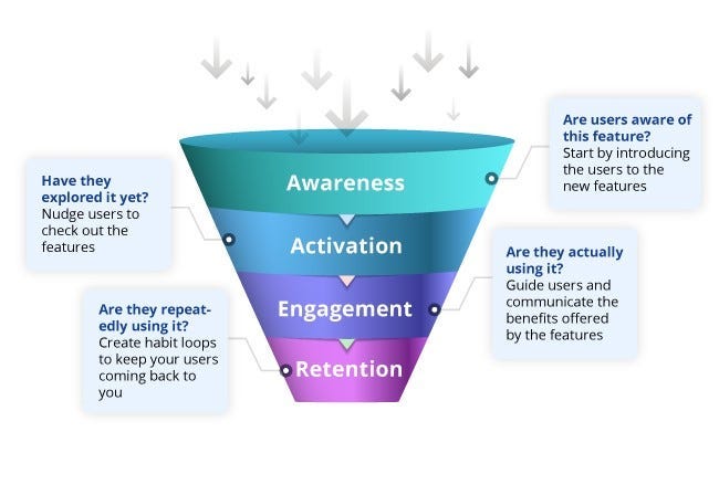
We might ignore the "Adoption funnel," a concept from Marketing, but it can be a critical tool in getting our team on board with your actions.
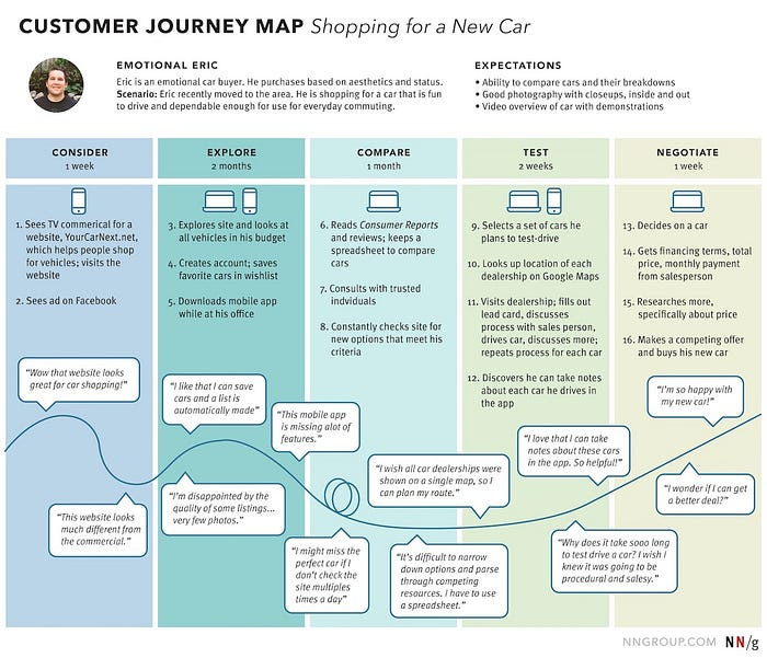
This often correlates with customer journey maps we create for our projects.
As a result, early-stage issues like login problems often ripple throughout the user's journey (and adoption funnel).
For example, if there are a lot of problems with our signup process and creating an account, it doesn't matter how good the rest of your user experience is for buying a product.
Why? If the problem is so bad, 95% of users quit before even logging in. As a result, fixing a bad first step may be more important than a critical usability issue that happens at the end of a customer journey.
So think about your users' workflow, and consider if there are usability problems early on that may affect the rest of the experience. If so, these are things we want to call attention to as high-priority insights.
Communicate the consequences of inaction through unhappy benchmarks:
Lastly, the easiest thing a team can do about a problem is nothing. They can promise to look at it again at a certain point, but that can mean next to nothing. So, if something is important, consider the project's primary goals.
You don't have to know much about analytics, product vision, or anything like that to communicate user findings.
While not always, projects often start because of an "unhappy benchmark": there's a common customer pain point, or user engagement on this product is low. What's more, you've been told, through project goal summaries or documents, what that benchmark is.
So, bringing that into your explanation can be a powerful tool to persuade people. For example, if a project was started because people aren't using our current version of a tool (i.e., adoption), saying something like:
"One of the likely barriers to adoption is because of (your user finding), and here's how we could resolve it."
Saying something like this may drive action in a way that you don't expect.
That, in itself, can drive your team to engage with your user research.
User research is communicating and decision-making about the future
I lost my excuse for boring research presentations when I moved into the startup world.
When time and resources are short, you don't just produce a checklist and summary of information; you need to show how user research helps uncover insights and convey their significance.
However, learning to do this allows you to drive meaningful design changes. It's not about what you’ve discovered users do: it’s how you present it and what action you can inspire from it.
Now, more than ever, you must learn how to convey your findings better when research budgets are tighter. So, if you've encountered your team failing to act on what you find, try to create insights that compel them.
I'm creating a Maven course on Data Informed UX Design! If you're interested in learning (or would like to provide feedback), consider filling out this survey.
Kai Wong is a Senior Product Designer and Data and Design newsletter writer. His free book, The Resilient UX Professional, provides real-world advice to get your first UX job and advance your UX career.


