
Want to get better at using color? Try a scatter plot
Creating scatter plots teaches you advanced lessons about color


Scatter plots are usually charts that people are vaguely familiar with.
It’s a chart that’s often thought of as complicated and niche. But they can offer important lessons about color that you might not realize until you’re trying to create them.
And it starts with the type of message it’s trying to convey.
Scatterplots, distribution, and relationships
Scatterplots are mainly used for two major reasons: to show distribution patterns and relationships. They allow you to encode data on both the x and y-axis to see if relationships or patterns exist between two variables.
But they have a reputation for being hard to understand. This is where I might be tempted to say that is a misunderstanding, but it’s really not: scatter plots are often hard to understand. To explain why, first, let’s talk about an easier chart to understand: a bar chart.

I haven’t included labels, axes, or even an explanation of what these bars might represent, but there are many conclusions that you can draw from this.
You could talk about how the purple bar is big (which can be good if it represents us), how it’s several times bigger than the grey bar, or how the grey bar is small.
Now try doing that with a scatter plot.

Without labels, context, or any other sort of guidance, it’s hard to make sense of this sort of data at a glance.
If I had gone one step further and removed the trend line, it might be even harder to make any sense at all.
The data itself might be hard to understand by itself, as there are no immediately obvious patterns, but that shouldn’t faze us as UX Designers.
We can work in complex domains, such as finance or healthcare, and make sense of otherwise difficult-to-understand data or terminology. But there’s one thing that stands out with scatter plots that we can learn from: color.
To create great scatterplots, you need to think a lot about color.
Distribution trends: Using color as identity
For many other charts, color is a way of accentuating certain values while de-emphasizing others. This can be a way to get people to pay attention to certain values.
But for scatter plots, color can play another important role: identifying groupings in a large ocean of data.
To understand what I mean, let’s look at a simple scatter plot:
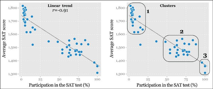
Source: The Truthful Art
We can see from the plot that there are several clusters here that might warrant investigation, but that by itself doesn’t tell us much.
However, what happens when you use color to identify certain groups in the data?
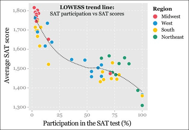
Suddenly, it’s a whole lot easier and quicker to see patterns. It’s not just random clusters of data: by assign colors based on some attribute in the data, you can quickly begin to see patterns or groupings, even if you don’t know much about the subject.
In scatter plots, color often takes the role of other common variables: for example, colors replace what might be a “Region” label in one chart, or “Occupation” in another.

SourceL https://eagereyes.org/blog/2014/my-favorite-charts
This doesn’t seem like it would be that important until you begin to try and quantify relationships.
Relationships are complicated (or eating more chocolate won’t win you a Nobel prize)
Let’s go back to the bar chart example and think about how we might create a comparison.
We can easily compare these two values, even if we didn’t have the numbers: for example, the purple bar is nearly 5 times as long as the grey bar.
But how do you summarize this?

Scatter plots are often used so that you can see if there is a relationship between two variables, but what’s the difference between a strong and a weak relationship?
This is where I’ll delve into statistics for a little bit, so bear with me on this.
Statisticians use the correlation coefficient, or r, to determine this.
This variable ranges from -1 to 1, and the closer to 1 or -1 r is, the stronger the relationship between the two variables.
But r by itself proves nothing: you have to do a lot more statistics work to determine validity.
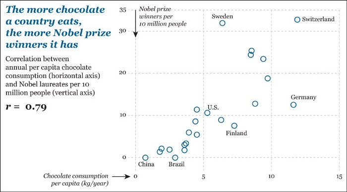
Source: https://learning.oreilly.com/library/view/the-truthful-art/9780133440492/ch09.html
Sadly, this chart isn’t true, despite the r-value being high. The reason it isn’t true is because of a phrase you’ve probably heard: “Correlation does not equal causation.”

Source: http://tylervigen.com/spurious-correlations
Just because two things are correlated doesn’t mean that one thing causes the other.
And if your eyes began to glaze over when reading about statistics slowly, imagine how your audience might feel.
So how can you turn this talk about relationships into something that your audience can understand?
By replacing scatter plots with color.
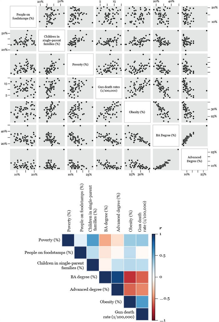
Source: https://learning.oreilly.com/library/view/the-truthful-art/9780133440492/
The chart on the top is called a scatter plot matrix: it’s a way of comparing every possible combination of variables to see if relationships exist between the two. It is usually used by academics writing code and is nearly unreadable.
The chart on the bottom is called a correlation matrix: it takes the data from each scatter plot (specifically r) and uses color to plot it in a way that’s a whole lot easier for audiences to read.
Once again, color replaces something (in this case, the whole scatter plot) to make it easier for the audience to read. Given that all of our data is essentially encoded into color, we need to make sure that we’re using color correctly.
So here are some lessons to keep in mind while doing this.
Understanding how color’s role with data
I’m not going to give a primer on color, as that’s beyond the scope of the article. I want to introduce a couple of ideas that you might want to consider when working with color in data.
Understand the importance of contrast with overlapping data:
This is largely specific with scatter plots. Consider how your color palette looks layered on top of one another.

If I’d leverage one complaint at the visualization, it would be hard to tell if there are 3 or 4 categories at a glance.
While two of the colors (purple and blue) might not be confused in isolation, there’s a lot of overlap between the blue, green, and yellow categories in the data. As a result, the area in the top-right of the map looks like it might be purple-ish.

Changing the purple color to something different (brown) makes it easier to see that there are 4 categories now rather than 3. While viewing colors in isolation may not cause issues, make sure to check if overlapping data may make things harder.
Understand color gradients and steps in scales:
One of the other functions that we saw was assigning values based on colors to a scale. However, one question you should ask is whether you want to use a gradient or a scale.
What I mean by this is considering how identifiable the middle steps of your scale can be.
To provide an example, we can look back at the coefficient image we saw earlier.
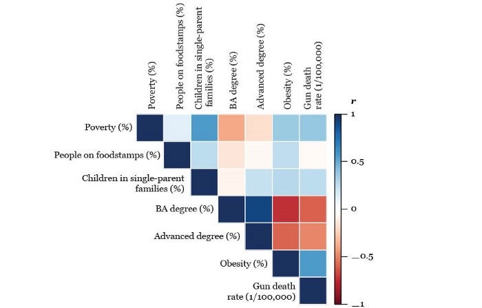
Source: https://learning.oreilly.com/library/view/the-truthful-art/9780133440492/
It’s easier to see extremes (Dark Blue and Dark Red), but it can often be harder to see the difference between values in the middle (closer to white).
However, given that we’re largely concerned with values on the extreme ends (i.e., those with strong correlations), it’s not a problem to use a gradient here.
However, when there are values in the middle that you want to differentiate between, or the scale is not necessarily that widespread, consider using steps within a color scale.
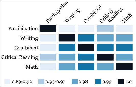
Source: https://learning.oreilly.com/library/view/the-truthful-art/9780133440492/
This allows you to provide enough contrast to understand the difference between the different sections possibly.
Learn scatter plots to learn about color
You’re likely not going to be using scatter plots (outside of academia) in your work that much.
They’re complicated to understand and are often best used to explore a dataset rather than presenting it to an audience.
But learning scatter plots can be a great way to practice working with color. Almost no other chart relies on the color that much to encode data, identify patterns, or otherwise quantify aspects of a chart.
So if you want to practice with color more, try and learn how to create a great scatter plot. It may teach you things you hadn’t realized.
Kai Wong is a UX Designer, Author, and Data Visualization advocate. His latest book, Data Persuasion, talks about learning Data Visualization from a Designer’s perspective and how UX can benefit Data Visualization.