Use sketch copy instead of lorem ipsum to save yourself some headaches
3 quick tips to align your content and design early in the project

You can save yourself a lot of headaches if you don’t use Lorem Ipsum, especially on your home page.
Lorem Ipsum, or placeholder text, is something many designers rely on to quickly fill in a design with text elements. It tends to be used when you may not have the finalized copy of what should appear there.
It’s also the easiest way to take a content-last approach to design. By keeping content and design separate until late in the project, we might be avoiding problems until we have a much shorter time frame.
Last week, I talked about how hierarchical grids help us prioritize our design elements to think about content. But your design usually doesn’t just consist of images: it also includes text.
It’s crucial, then, to also consider how text content will be implemented in your design. The reason is simple: teams might not be considering how inaccessible the content is to readers.
Your content might be too hard for users to read
Here’s a sample heading from a volunteer Covid-19 project that I worked on:
“(Company name) helps users talk with medical professionals by telemedicine appointments to find appropriate Covid-19 resources.”
It’s not a catchy headline: it was just stating what the company was supposed to do. The team, composed of several medical professionals, came up with this to explain what the site was about.
You might be able to see why this headline is going to be hard for readers: there are a lot of unfamiliar words here that they might not recognize.
“Telemedicine” is a difficult word for people to understand, but surprisingly so are “medical professionals” and “resources.” Users are used to more straightforward words, like “doctor” and “help.”
As a result, adopting this headline turned out to be much better:
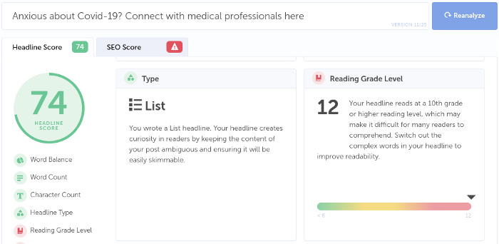
“Anxious about Covid-19? Connect with medical professionals here.”
Plain and simple language is for everyone, even experts. In addition to supporting international and English as a Second Language (ESL) users, it welcomes the reader to the website and communicates information succinctly.
But when your text content may live in Agile user stories, and your designs live elsewhere, it can be hard to see and argue for these changes. You also might not want meetings about the design to derail into discussions about content that hasn’t been finalized yet.
So what can you do to incorporate text into your designs? The answer is simple: sketch with words.
The step between content and placeholders
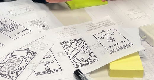
Sketch copy is essentially sketching with words. Just like you might use a sketch to illustrate your visual design roughly, sketch copy is a rough draft of the text you’d put there that gives more context.
Some examples of this include:
“This headline will have eight words in total” (conveys word count)
“This subhead talks about the product benefits” (conveys intent)
“The Call to Action (CTA) is ‘Learn more’” (conveys action and the content type users will see)
These simple things allow you to monitor your content as you develop your design continuously. For example, if your team decides to update the header text to something a little longer, then you can update the copy to reflect this.
For example, “Based on team discussions, this headline will have twelve words in total.”
When you type that out, the size 36 font that you typically use for headers might cause the text to wrap. As a result, you’d either need to adjust your headers site-wide for consistency or spend some time talking about it with your team.
Working with sketch copy usually allows you to spot issues with the content right away. Something supposed to be a paragraph of text is 1 or 2 long lines with that size font and text box. Or the heading suddenly becomes super long because you hadn’t expected your words to look like that (in size 36 font).
As a result, your design might change to suit the content or vice versa. Doing this early on in the process allows us to refine our designs with plenty of time, rather than face headaches that come from making a ton of changes later on in the process.
However, this isn’t the only content tip to think about. You can use free online tools to do something that most content creators think about constantly: test the readability of our headlines.
Quick and easy headline readability
Here’s a secret: most writers and content creators spend a whole lot of time thinking about headlines.
After all, if the headline doesn’t engage you, readers won’t click on your story even if it’s interesting.
As a result, there are many free online tools out there to test out how engaging your headlines might be. These can be useful in considering finalized page titles or headlines to make sure that they’re easy for readers to understand.
Currently, I use Headline Studio, but I’ve used Hemingway Editor, Readability Formulas, and Readable in the past.
Some have custom scores that grade your headlines, but they’ll tell you the reading grade level at the very least.
This reading grade level is essential to consider when making it easy for your audience to read. The Nielsen Norman Group recommends aiming for a Grade 8 reading level for general audiences, and Grade 12 for educated or specialized B2B audiences.
If the headline only makes sense to you and your team, that means that your content is less accessible for the rest of the audience.
Incorporating sketch copy or finalized content in your design also allows you to use another method of quick user feedback: the five-second test.
Use five-second tests
When you incorporate both essential design elements and basic text into your designs, you can use five-second tests to understand if users are getting the right first impression.
The five-second test is a research method designed to gauge a user’s first impression. They spend five seconds on a website and then immediately try and answer these five questions.
What is the purpose of the page?
What are the main elements you can recall?
Who do you think the intended audience is?
Did the design/brand appear trustworthy?
What was your impression of the design?
The design doesn’t necessarily need to be completely fleshed out at this point for them to do this. It’s more about understanding your user’s first impressions of the website and whether you’re on the right track.
It doesn’t matter if your design is highly polished: if it doesn’t seem like the website will serve the user’s needs by the first impression, they’ll leave. Users often leave web pages in 10–20 seconds, so it’s essential that they understand what you’re offering in the first 10 seconds.
Words matter more than you realize
As Designers, we often spend time making sure we don’t have any extraneous design elements on the website.
Extra icons, spare buttons, and generic images often take up space rather than serve a useful purpose. As a result, it’s not that hard for us to think about cutting those extra design elements from the page.
We should take that same mindset towards the text populating the page. While design elements and images help, users are also checking the text to see if this website will serve their needs and whether to engage with it further.
To avoid content-last problems in the design, take a moment to consider and implement sketch copy into your designs. Doing so allows you to think about how content and design will interact with each other, and avoid problems that might come later on by ignoring that.
Kai Wong is a UX Specialist, Design Writer, and Data Visualization advocate. His new book, Data-informed UX Design, explains small changes you can make regarding data to improve your UX Design process.


