Understanding pre-attentive attributions and perception
Up until now, I’ve covered how information can be conveyed through both stories and based on user’s information-seeking behavior. We’ve then spent time turning those ideas into sketches and storyboards and created some rough visuals based on what we’ve seen.
But just because you’ve organized your data in a manner that seems to match most people’s information-seeking behavior doesn’t necessarily mean that they’ll understand it.
To make sure they don’t get confused or overwhelmed, you also have to pay attention to perception and cognition.
When I was learning UX, there was always some time dedicated to understanding human perception to explain Gestalt principles and colors.
But it wasn’t until I tried to visualize more complex ideas that I truly began to understand the importance of perception and cognition in Data Visualization.
Why perception and cognition matter for Journalists
One of the things that I feel that I must constantly emphasize when it comes to the Journalism approach is that they don't have access to users.
Alberto Cairo developed his visualization process to meet weekly deadlines with limited budgets and tight space.
These reasons are why perception and cognition are so important: if you're generating visualizations for millions of users weekly through magazines, newspapers, or newsletters, you need to know how people perceive and understand them.
You rarely get second chances if you make a mistake. If you make an error that causes your readers to misunderstand or misinterpret a visualization based on their perception, that's what will print.
So how you create good visualizations?
You do this by understanding how people think.
Thinking, Fast and Slow
“Visualization is not something that happens on a page or on a screen; it happens in the mind”— Alberto Cairo
Daniel Kahneman’s Thinking Fast and Slow talks about two systems that are present in human cognition:
• System 1 operates automatically and quickly, with little or no effort and no sense of voluntary control.
• System 2 allocates attention to the effortful mental activities that demand it, including complex computations.
These two systems help break down information into things that we can process, with System 1 actions allowing us to perceive relevant information to make quick decisions. In contrast, System 2 will enable us to parse out more complex data.
So let's talk about each of these systems in detail, starting with System 1.
System 1, or playing Pictionary
The easiest way to understand perception is with a single question that we've had to ask ourselves for centuries:
Is that figure in the bushes a lion or a log?
To start, we should first talk about the difference between seeing and perceiving is.
Seeing is almost an unconscious process: our eyes are like camera lenses, which can capture light that is bouncing off an object that stimulates certain parts of the retina. They make tiny movements called saccades to scan around quickly, and then they fixate on specific points, all in rapid succession. The eye then sends electrical signals to the brain, which then attempts to process that image into something through perception.
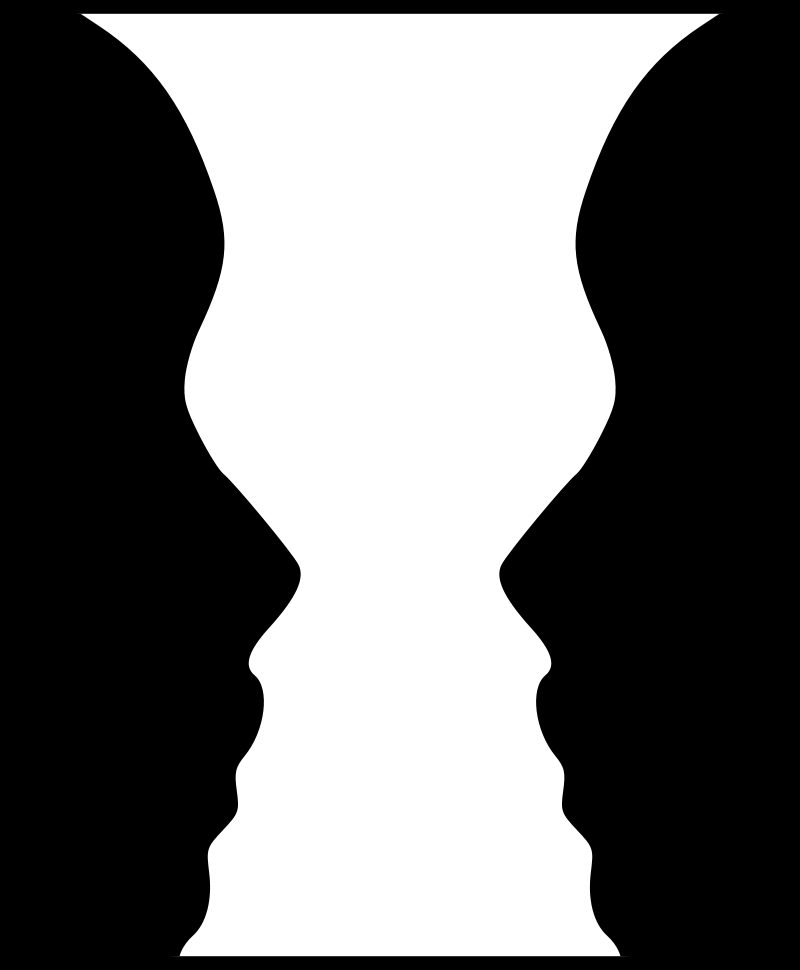
Source: By Hans-Werner Hunziker, CC BY 3.0, https://commons.wikimedia.org/w/index.php?curid=15122756
However, not all information is perceived equally: specific visual cues, such as faces, draw the user's attention in this cycle. As the brain sees a bunch of fixation points, the brain attempts to fill in the blanks through perception. This cycle is kind of like racing to figure out a half-formed puzzle as quickly as possible.
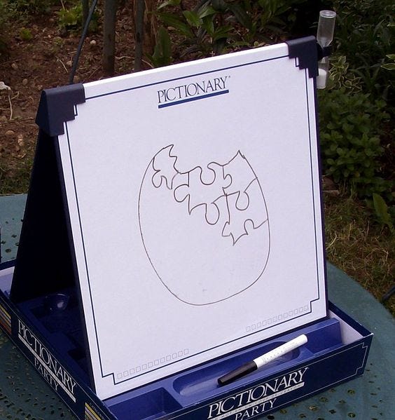
In much simpler terms, our brain is playing Pictionary.
To understand why the brain does that, let’s go back to the question.
Is that figure in the bushes a lion or a log?
Waiting until all the data points show that the figure is a lion is like waiting until the picture is fully drawn in Pictionary. If you did that in Pictionary, you might run out of time, or the other team might guess correctly on a half-finished drawing and get the points.
If you did that in real life, you'd get eaten by the lion.
Perception, therefore, is essentially about your brain using whatever data you've obtained through specific cues and quickly completing the picture to decide what actions you need to take or what to focus on next.
But here's where things get tricky: our brains have evolved to treat perception like the rules of Pictionary. If you guessed wrong and decided to run away from what turns out to be a log, nothing terrible would happen to you. Likewise, you're not penalized for a wrong answer in Pictionary. But if you decided to wait and see for a complete picture, you might get eaten for a lion.
So system 1 is all about speed: in fact, it prioritizes speed over accuracy. To make sure that the brain perceives the correct visual cues from the start, we need to figure out how the brain prioritizes visual cues. To figure this out, let's turn to Colin Ware's model of perception.
3-stage model of perception
Colin Ware, head of the Data Visualization Research Lab at the University of New Hampshire, created a 3-stage model to highlight how visual perception works. These different levels allow us to see which visual elements are processed first, which can provide a lot of guidance for how we should approach designing for perception.
1st stage: Tunable/pop-out features
The first stage of perception happens similar to what we described earlier: neurons in the retina pick up "low-level" features in the visual field. These features may include edges, motion, colors, and others. These are known as tunable or pop-out features.
These are called this because there is some distinct element in the object's features, which causes it to pop-out from the background, drawing our attention to it. This process can even happen unconsciously, as our eyes tend to search for something across three distinct channels:
*Shape features, such as position, size, elongation, orientation, and texture
*Color features, such as hue, lightness, and intensity of color perception
*Motion, such as speed and direction of motion.
These features tend to process pre-attentively, which means they're some of the first things that our eyes process. Assuming that these are well-designed, we can process these things faster and usually with few errors. For example, we tend to be good at the following tasks that rely on tunable features:
• spotting an element
• detecting the edges or boundaries between groups formed by elements
• following moving elements
• calculating or estimating quantities
Usually, only a few design elements can fall under tunable features because using multiple features across these channels reduces the contrast each component has compared to the background.
It’s easy to pick out the 7’s in the middle example compared to the top, but each new tunable feature you try to add makes the 7’s harder to find.
As a result, these tend to be reserved for the most basic elements: identifying a central piece or following something moving. However, there are several other stages of visual perceptions to examine.
2nd stage: Gestalt principles
After looking for tunable features, our brains tend to look for patterns or groupings of these features.
Gestalt principles are understood as collections of tunable features organized into groups or entities by 7 Gestalt Laws and one Gestalt principle. Gestalt Laws are rules based on understanding how humans perceive and group visual elements. Looking for these groups requires focusing your attention, which results in this being a much slower process.
These are:
Proximity: Elements close together tend to be perceived as belonging together
Similarity: Elements that are similar to one another, through size, color, or shape, are perceived as belonging together
Continuity: With intersecting shapes, parts that form a continuous line are perceived as belonging together
Closure: Elements that form a closed shape are perceived to belong together.
Symmetry: Elements tend to be perceived as being split into symmetrical elements if possible.
Good form: Elements will combine to take the simplest shape possible
Common Region: Elements tend to be perceived into groups if they share an area with a clearly defined boundary.
Figure-Ground: While not a Gestalt law, this allows us to see shapes or figures by enabling us to see them as distinct as from the background.
These Gestalt principles help us understand how the human brain groups individual features into larger elements, but there is one more stage to the model of perception.
3rd stage: Visual variables
Visual variables refer to the visual means used to add information to the glyphic elements representing data points in a visualization. In other words, this is the type of information that allows us to make sense of things like charts: essentially, what is each category called, how are the categories ordered, and what numerical values are there associated with this. These could be axis labels, how they're grouped, how data is represented, and so forth.
While there is a lot to explore here, this starts to enter the realm of academic research outside the book's scope. For the time being, let's leave it at thinking about the way a chart is represented and organized.
So how might we arrange our design elements based on these stages? To figure this out, let's look at an example.
Examining perception through an example
After understanding the basics of perception, let's see how they might apply to a design of ours.
Pre-attentive Features
We can gather from this that the brain loves a difference in the types of actions it immediately takes.
One of the first things that it does is try to distinguish the foreground and background, using pre-attentive attributes like color if possible. This is done by detecting object boundaries: figuring out where one object ends and another begins. One of the first things that stand out is pre-attentive attributes like color and contrast: a significant distinction allows the brain to quickly accomplish this task, while low contrast makes this more complicated.
This is a critical feature because your brain is better at quickly detecting shade variations than shape differences: this is why it's easier to pick a black-colored letter out of a series of gray letters versus a black-colored "7" out of a series of random numbers.
As such, color is one of the most important and quickest ways to leverage pre-attentive features. If you want to differentiate or isolate a single category, making them a different color is one of the fastest ways to highlight a difference. However, this does have a limit: doing this for multiple values can make it harder for people to see.
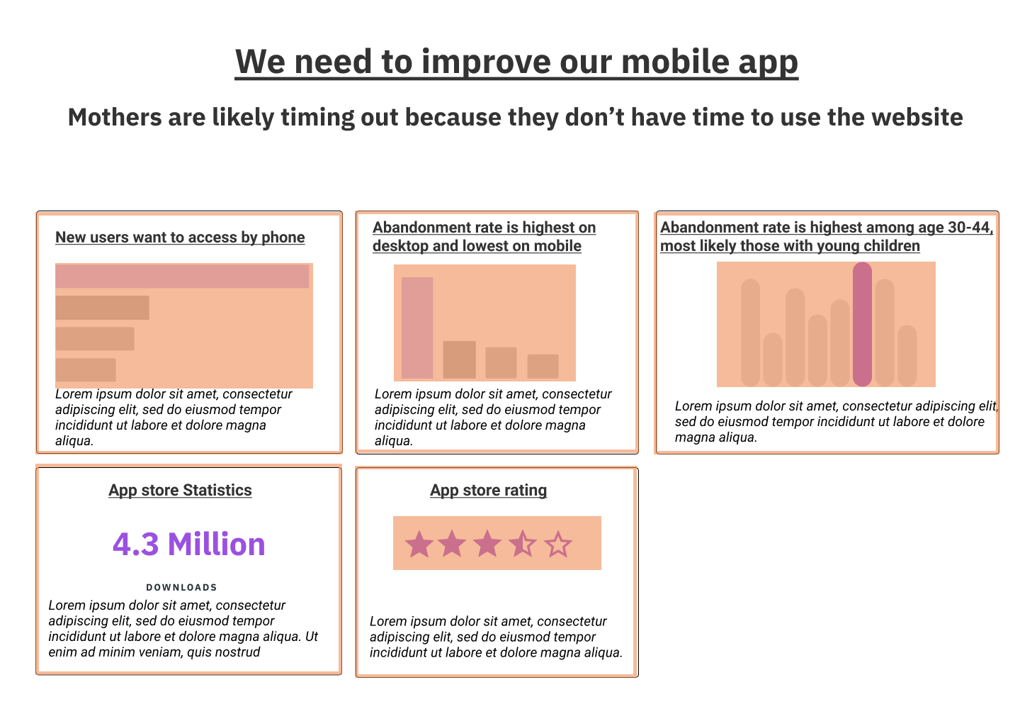
So let's go back to one of our charts involving mothers.
This is how this would be perceived at the pre-attentive stage.
Remember, at this stage, our brain isn't processing what this is yet. All we're doing is noticing the low-level aspects of the entire chart, such as the bar, stars, or words that contrast with the rest of the page through color. One thing that stands out at this stage is the edges of the objects: our brain sees that there seem to be five boxes here, but we might try combining them as noticing all of these object edges seems to require a lot of brainpower.
After that comes the next stage of visual perception.
Gestalt checklist
We've talked about many different Gestalt laws, but at its core, Gestalt principles are a way to see how the visual brain is a device that has evolved to detect patterns. Whether these patterns are grouping things by size, shape, orientation, or some other method, these are ways our mind perceives how things fit together.
While it is good to know the Gestalt laws to understand why we should change something, what matters more is to take a look at the visual groupings and see if there are things to be changed.
When we examine how information is grouped through the Gestalt laws, we begin to see a clearer picture of what's going on. While the Gestalt Law of Proximity (for the bar and histogram charts) and Similarity (for the stars) seem to be decent groupings, we could improve the rest of the data.
We're relying a lot on the Law of Common Region, with the borders, to group our data: it seems like the groupings might be a little weak if the edges didn't exist. We can see this with the title and main point: we might want to change the spacing to make the grouping a little bit more clear.
How is the data encoded?
Lastly, we want to think about the visual variables we've used to encode the data. We can see that there are several different methods in the chart:
Encoding by length (through bar and histogram charts)
Encoding by number (with the stars)
Simple text (for number of downloads)
Given that these were generated simply as a sketch, we won't dwell too much on things missing, like axes or labels, quite yet. But simply from the visual variable level, there don't seem to be any significant issues. Given that the charts are intended to compare categories (in specific, how our chosen value tends to be the highest), using length is an accurate way to compare things.
Perception as a precursor to cognition
At this point, we've spotted some possible problems with how the chart is structured even before we have begun to understand what the data is trying to tell us. Small things, such as the possible overuse of borders, are causing our brain to work a little bit harder than necessary at this point.
And while it might just seem like a minor thing at this point, this can significantly affect the overall comprehension of a visualization. To understand that, let's now take a look at cognition.


