
Understanding Cognition

Until now, we’ve covered several different ways of understanding how your users may perceive your work. We’ve talked about user’s information-seeking behavior, the importance of using a story structure, and how user’s may perceive elements on a low-level visual perception scale.
But just because you’ve organized your data in a manner that seems to match most people’s information-seeking behavior doesn’t necessarily mean that they’ll understand it.
As a UX Designer, I had learned a lot about understanding human perception to explain Gestalt principles and colors. But it wasn’t until I tried to visualize more complex ideas that I truly began to understand the importance of cognition for Data Visualization.
Because I didn’t understand those topics, I made a mistake that most people make when visualizing a complex subject. Here’s how to avoid that.
Reviewing the two systems
To provide a review, we talked about how two systems are present in human cognition:
• System 1 operates automatically and quickly, with little or no effort and no sense of voluntary control.
• System 2 allocates attention to the effortful mental activities that demand it, including complex computations.
These two systems help break down information into things that we can process, with System 1 actions allowing us to perceive relevant information to make quick decisions. In contrast, System 2 will enable us to parse out more complex data.
I’ve talked about System 1 a lot through pre-attentive attributes and visual cues.
But that can only take you so far: at this point, you have drawn your user’s attention to where you want them to focus, but they haven’t begun to break down that information into understanding.
To do that, we need to engage with System 2 and talk about Cognitive load.
Cognitive load, the historical stumbling block
Cognitive load refers to the number of working memory resources that you have to devote to something at one time. Cognitive load theory is something that is primarily used in instructional design, where the purpose is to instruct users on new pieces of information and is something we can apply to our visualizations.
It consists of 3 elements: Intrinsic, Extraneous, and Germane.
Intrinsic load is a measure of how inherently difficult the data is
Extraneous load is a measure based on the design of how information is presented.
Germane load is a measure based on how we organize data into new patterns (called schemas) or utilize existing ones for context.
Adding all three loads together gets us another value, known as Total Cognitive Load.
Suppose the Total Cognitive Load of the information is less than the working memory of the users. In that case, most users will be able to store the information in their working memory and be able to process it into their long-term memory.
On the other hand, if the Total Cognitive Load is too much, many users run into difficulties in storing the information in their working memory and processing and recalling the information at a later date.
Historically, when journalists or other professionals didn’t have access to test visualizations with their users, they had to rely on this sort of model to make sure that what they presented to their readers was understandable.
But this led to a common mistake: they would assume their users are dumb and, as a result, simplify their message to reduce Internal Cognitive Load.
However, this is a mistake: You should never dumb down your data because you’re afraid that your users won’t get it.
Never, ever dumb down your data just because you think your readers will not “get it.” — Alberto Cairo
A visualization is a powerful tool that can clarify complex messages, highlight trends or patterns in lots of data, and reveal insights. Great visualizations can even present complex data and abstract ideas so that the general audience can understand them.
So what can we do about it instead? We can reduce the Extraneous and Germane Cognitive load instead.
Reducing extraneous load by abstraction
One of the most common extraneous load sources is when your attention is directed to the wrong place by System 1. And the simplest way to explain this is to show you an example.

A flawed American Airlines Safety Card
When you looked at the picture, was your attention immediately drawn to the specific words and actions that the people were demonstrating?
Or did you pay attention to the man with a mustache and a Hawaiian shirt?
The unfortunate fact of the matter is that sometimes the visual cues get in the way of understanding, particularly if you’re meant to pay attention to something other than the person. Sometimes it’s better to use something abstract rather than something realistic.
“As we continue to abstract and simplify our image, we are moving further from the real face of the photo.”- Scott McCloud
To illustrate this, let’s think back to the photo we talked about earlier with perception:

Source: By Hans-Werner Hunziker, CC BY 3.0, https://commons.wikimedia.org/w/index.php?curid=15122756
When someone has a realistic face, we can see that it’s a visual cue that our eyes perceive as one of the first things: as a result, it takes cognitive effort to ignore that cue and pay attention to something else. But what happens if you abstract something?

Which face draws less attention?
In that case, our eyes don’t immediately jump to a specific visual cue, which allows us to spend time understanding what else might be part of the diagram. Consider the following airline safety card: does it do a better or worse job explaining safety measures? I would say it does a better job: because the face has been abstracted, we can notice other visual aspects, such as the red lines and arrows.

Source: First version of SWISS A-330-300 safety instructions by Caumasee, CC BY-SA 4.0
So how does this tie to visualizations? We should remove extraneous details so that our audience can focus on where we want them to pay attention. There are a few things that we can leverage to do this, such as:
Show visually, don’t tell:
One of the most common things to do to reduce extraneous cognitive load is to show something visually rather than explain it in words. Having to re-create something in your mind based on a description visually is one of the most taxing things to make the audience do. Given that you’re already creating a visualization, you may already understand this, but you may want to see if you can visually show things rather than just using words.
Provide cognitive aids:
You can also provide cognitive aids to your audience. Like visualizing information, you can try to add things like examples, glossaries, or checklists to make it easier for a person to comprehend. While you still may be asking the audience to visualize something in their minds, through the use of examples, analogies, and other methods, you can allow them to understand how things fit together quickly.
Maximize signal to noise ratio:
Lastly, we can consider something called the data-ink ratio, as another way to think about the elements that are complex or otherwise obscure the message. Edward Tufte developed the Data-Ink ratio as a way to talk about the total amount of ink presenting the data divided by the total amount of ink used to print the piece. The more extraneous stuff there is in a chart, such as lines, labels, and background images that don’t serve a purpose, the lower the data-ink ratio.
Minimizing clutter that gets in the way of expressing your ideas, such as additional instructional text, tick marks, axis, or labels, can be an excellent way to reducing Extraneous Cognitive Load. But that doesn’t mean that you should always reduce this as much as possible.

Both of these types of charts have their uses.
The chart on the right seeks to reduce a lot of extraneous elements, such as tick marks and axes. But that doesn’t mean that the chart on the right is always better than the one on the left.
Sometimes, it’s better to have redundant design elements: having both a bar length suggesting a number based on the axis and labeling the number directly on the bar can help if the need for accurate numbers is essential. Whether or not redundant elements are crucial will depend on the goal of the chart.
In many ways, reducing Extraneous Cognitive Load is very similar to pursuing a high data-ink ratio, except that sometimes redundancy (or a little clutter) is helpful if it promotes clarity of message.
But this isn’t the only way to reduce Total Cognitive Load: we can also promote Germane Cognitive load.
Promote Germane load through scaffolding
According to Cognitive Load Theory, Germane Cognitive load is about the process, construction, and automation of schemas.
But the better way of thinking about it is through the concept of mental models. A mental model is how our users understand the world or a website based on previous experience or similar scenarios.
For example, if you know that if you see a piece of text underlined and in blue on a website Like this, you know that’s probably a hyperlink and will take you to a different website.
Schemas are patterns or small parts of a mental model that help the user process information. But how you acquire that data can be easy or through a lot of trial and error, depending on how easy it is to learn. Therefore, we want to promote Germane load by these strategies.
Write concisely:
While this can also fall under reducing extraneous cognitive load, writing is one of the primary instructional information sources. If we don’t understand what we’re supposed to do based on the visuals, we often look for instructions or perhaps a summary. When you’re first introduced to a subject or task, you usually read some instructional text to get into the correct mindset and remember it later. As such, attention needs to be paid to writing as concisely as possible.
Promote Generative Strategies:
Generative strategies are those that emphasized learning with the individual, usually by asking queries. Many online course websites, such as Coursera and edX, often have questions in the middle of their lectures to ask about specific concepts that they have just introduced. They do this because these courses are self-guided: if you were to listen to one lecture, then listen to the next a week later, you might forget the concepts that they were talking about.
As a result, they make sure to do their best to reinforce lessons by making them think about the concepts and answer questions about them right away. You can use this type of strategy within your visualization by leveraging user’s information-seeking behavior. By making visuals that speak to a single key message and have some elements to contrast with, we can guide the learner to explore further if they’re interested in the matter.
Promote Scaffolding:
Scaffolding is a term used to describe providing assistance in the learning phase and slowly withdrawing the assistance as a learner can perform the task independently. The best example of this comes in the literal sense: riding a bike.
When you first start out riding a bike, you have permanent structures called training wheels. These are additional solid structures that will support the person no matter what and allow them to get used to the feeling of riding their bike without any issues. As the person gets more comfortable with the bike, a more temporary version of scaffolding is used: we may remove the training wheels, but another person will stand by the bike rider to allow them to balance and catch them if they fall. After the person is even more comfortable, then all scaffolding is removed, and the person can ride the bike with no assistance.
However, the best use of scaffolding in visualization is to think about the complexity of the schema and how familiar it may be with your audience. If it’s a schema that the audience has encountered before and is very familiar with, you probably don’t need that much support, as the user knows what to do and how to use it. On the other hand, if it’s a schema that they’ve barely learned, you may need to put more concrete learning assistance so that they can learn how to perform the task in the first place.
So now that we’ve talked about Extraneous and Germane Cognitive Load let’s go back to our example to see what we can do to improve upon it.
Improving a sketch with Cognition
Let’s take a look at what we started with when we formed a sketch before considering perception and cognition:
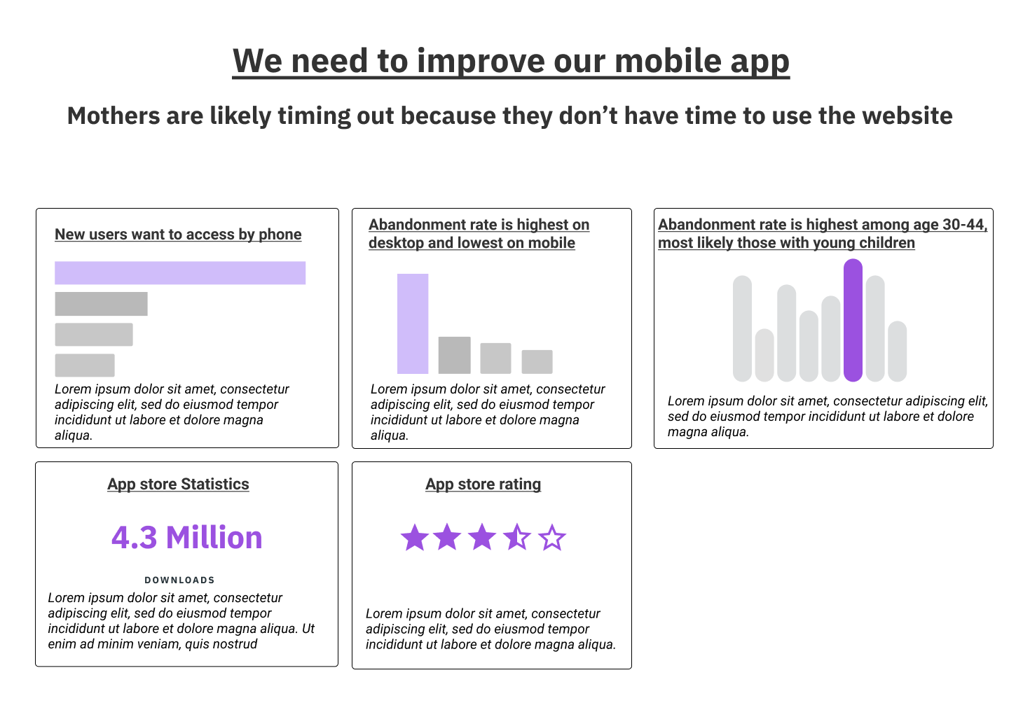
Let’s compare it with this:

We’ve done a couple of things in regards to both perception and cognition here:
We’ve grouped related categories so that we don’t have to utilize borders
We’ve made use of scaffolding by making the Google Play statistics category look similar to what you might encounter in the app
We’ve moved the text from below the chart to group it with titles
We’ve written concisely, with short headers and more descriptions to talk about the charts
We’ve simplified the charts only to emphasize specific categories, which can lead the user to explore further if they want
We’ve removed a lot of chart elements to make sure that the users know what to focus on
We’ve re-ordered the charts in order to be more in line with our message
That’s not to say that we’re completely done with our sketch at this point in time: right now, this is missing a lot of the design elements that we’re used to seeing with visualizations. There are still a number of things that we might use to better design these chart for our audience. But at this point, we have made charts that are understandable to the average user, which is how journalists approach things.
Clarify your message
It may be tempting to dumb down your message to the lowest common denominator in our current information-rich age.
It may seem like everything is fighting to grab your attention by providing a dumbed-down message, and simplifying your message sometimes has some benefits.
But it can only take you so far.
If you want to create better visualizations, you should work on how to clarify your message to reduce cognitive load. Doing so allows you to tell more complex stories and insights, which is often precisely what we may need.
And that forms the basis of designing a better chart.