


The tragedy of pie charts
The importance of making sure to choose the right chart

After thinking about the larger story and the message you want to convey, the next step is to choose the best graphic form to fit your data. At this point, you should likely be selecting a specific chart, map, or other sorts of diagram that is likely to match the type of story that you decided on.
While this may not seem like that big a deal at this point, choosing a chart without thinking about the suitability can lead to erroneous results. And we don’t have to look any further than pie charts to understand this.
Pie charts
The pie chart is one of the most hated charts in all of the visualization, and it became that way because it was misused. They’ve garnered a reputation for being ineffective, lazy, and just plain harmful because they were used for nearly everything.
But pie charts are not entirely useless: they are still helpful charts for certain types of stories. Instead, the fault lies with the mismanagement between their visual elements and the goals of the data.
By misunderstanding the four elements of visualization, users chose pie charts instead of more suitable graphics.
The 4 elements of visualizations
According to Nathan Yau’s Data Points: Visualization that means something, 4 elements make up a chart: visual cues, a coordinate system, scale, and context.
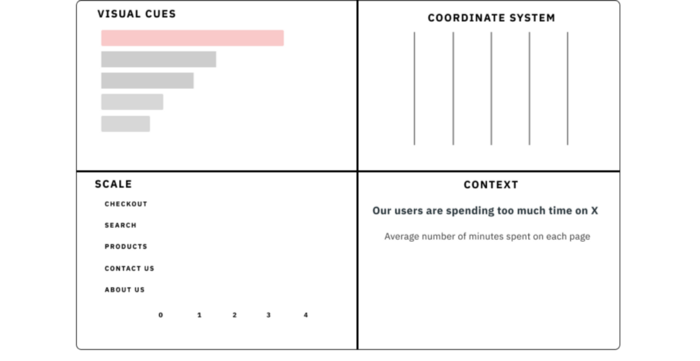
The individual parts of a chart

The full chart
Choosing various elements, usually visual cues, is what can turn a bar chart into a column or line chart. However, these visual cues shouldn’t be chosen randomly: different visual elements are best suited for various data types.
For example, lines and points can be used when we’re concerned about involves changes over time. But multiple visual cues may be suited towards addressing. For that example of changes over time, it wouldn’t be uncommon for bars to be a viable option (i.e., creating a bar chart).
And while there is a great deal of depth to the types of charts that you can create based on these elements, let’s take a moment to focus on a single component for visual cues: accuracy.
So that’s where we have to consider something else: how accurately our users can perceive these visual cues.
Accurately perceiving visual cues
In 1985, William Cleveland and Robert McGill conducted a study on graphical perception to understand how accurately people perceive visual cues. This resulted in this sort of ranking system of how accurately people can read visual cues and use them to compare between different values.
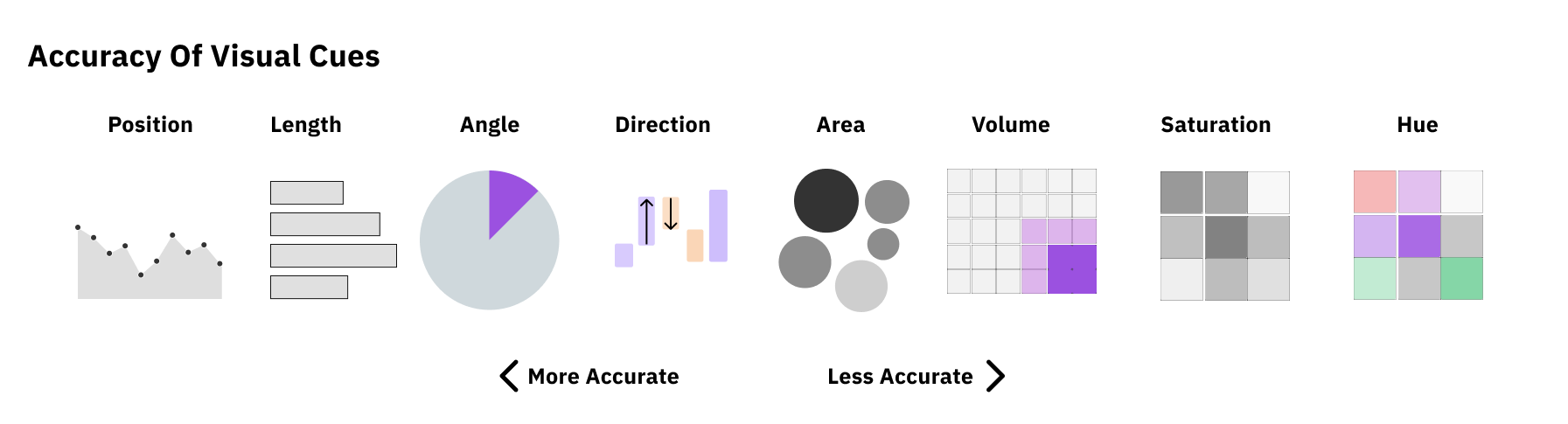
Accuracy often is a big influence in determining which chart to use, especially for comparisons. Since users can perceive position more accurately than length, it makes sense to use a chart that utilizes position (i.e., line charts) for changes over time unless there is a specific reason not to.
More importantly, this accuracy is a huge factor for specific questions, such as comparing values across many different categories.
Which visual cue is easier for comparison?
So with that in mind, let’s look at the elements of a pie chart and how it can yield much less accurate designs.
The characteristics of pie charts
A pie chart, contrary to the more common charts, uses two odd elements: A Polar system and angles.
Polar system:

Source: https://en.wikipedia.org/wiki/Polar_coordinate_system[https://en.wikipedia.org/wiki/Polar_coordinate_system]
Almost every standard chart uses a Cartesian system, which is better known as the X & Y chart. From points and lines to bar lengths, all of them use this system to produce measurable visual cues. Except for pie (and donut) charts: they use a Polar system. A Polar chart is a coordinate system in which measurements are recorded in angular measurements.
And this almost immediately leads to some issues.
First and foremost is that there is always a fixed size for Polar charts. A Cartesian system graph can have scales ranging from 1–5 or 1–100, which can result in more accurate visual encoding measures. But a Polar chart must always be thought of in 360 degrees. One of the cardinal design rules for pie charts is that they always must add up to 100%. As a result, it must use another inaccurate measurement, angles.
Angles:
Given the accuracy chart from before, we already know that angles are less accurate than other visual cues. But to understand why to let’s take a look at how pie charts compare to bar charts.
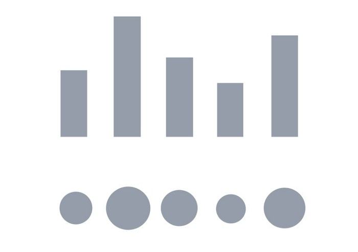
Imagine you wanted to figure out which category was about 13 units long. If we were to use the elements that we’ve talked about, this is how it might look in a bar chart.

It’s pretty easy to see that Category E looks closest to 13 blocks long, even if you didn’t know the exact measurements. The bars’ length, combined with the scale, shows us which categories are between 10 and 20 units long.
But you can’t merely have something 13 units long in a pie chart: the pie chart has a fixed measurement area of 360 degrees.
So you would have to convert 13 units into 13% of the total. Given that 1% of the chart is 3.6 degrees, you would be looking for the category that is 13 * 3.6 = 46.8 degrees out of 360.
Could you tell me at a glance which category is on this chart?
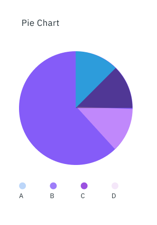
Probably not. You’d probably need additional context to explain these sections, which often defeats the purpose of a visualization in the first place.
What are pie charts good for?
I’m not that much of an expert in the field to give a definitive diagnosis on the future of pie charts. But thinking about it from an audience perspective, I can say that there’s one strong but niche case for using pie charts.
And that’s to show minority or majority.

We know that the chart components (i.e., using angles and the Polar system) make for a very inaccurate chart for comparison and even composition. But that doesn’t matter if the visualization’s goal is to show that you are a small or large part of the larger picture.
It’s a much rarer use of this chart than how it’s typically been used, which has resulted in these charts becoming the bane of every designer and data visualization specialist.
And unfortunately, it’s not the only one. Recently, there’s been a trend of another chart being used, bubble charts, with an eerily similar trajectory of becoming disliked. It’s considered a junk chart[https://junkcharts.typepad.com/junk_charts/2013/03/blowing-the-whistle-at-bubble-charts.html] by many professionals[


with it running into many of the same comparison problems[https://www.betterevaluation.org/en/evaluation-options/bubble_chart] as pie charts.

Can you tell which value is the 2nd largest?
But there’s a right and wrong reason to use this visualization, just like there’s a right and wrong reason to use the pie chart. The key is always to first figure out the message you’re trying to convey with your visualization.
Once you do that, you can consider how important accuracy is to convey that message and select the right chart.