
The questions to ask to avoid being misled by line charts
How thinking like a stock trader can help you interpret time-series data


But it can be one of the simplest to mislead with as well. The reason for this is simple: we often use line charts to try and predict the future.

Source: https://community.powerbi.com/t5/Desktop/1-line-in-a-graph-actual-and-forecast/m-p/221362
Forecasting is the art of identifying current trends and patterns to try and map out how something will perform in the future. But not only is predicting the future complex (according to Nassim Nicholas Taleb), but often we’re not asking some of the most fundamental questions about time-series data.
One of those questions is about a concept called seasonality, and it can often be a reason line charts may mislead you.
But the simplest way to explain this is with a visual.
Understanding Seasonal periods

If you saw this chart for project monthly sales of a ski resort, would you panic about the massive dip in numbers in June?
Probably not: you understand that the summer months will always be slower, given that you can’t ski in July.
Some factors cause a periodic fluctuation in the data, such as weather and temperature. This results in what’s called a seasonal pattern: in this case, it’s a pattern that’s likely to repeat for a certain period (in this case, 12 months).
But if that’s the case, we need more data for comparison: there’s nothing to be gained from comparing January’s sales to June’s.
Instead, we need to find a point of comparison that has similar factors affecting it. This usually comes in one of two forms:
Similar time period (June 2021 vs. June 2020)
Similar factors (You vs. competitors in June 2021)
But if the chart doesn’t include that information, we can easily be misled.
The importance of seasonal periods
“If you torture your data long enough, nature will always confess.” -Ronald H. Coase
This was a misleading line chart shown on Spanish national television, which showcased how unemployment was dropping, five years after the 2008 recession. It seems like cause to celebrate until we look at the details.
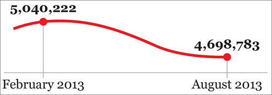
What’s wrong with this chart? Look at the time period: does it really make sense to compare February’s numbers to August’s? In this case, no.
According to Alberto Cairo, nearly 12% of Spanish jobs are related to tourism, which means that unemployment can be considered highly seasonal. When you expand the seasonal period to what you might expect, a period of 12 months, you get a better sense of what’s really happening here.
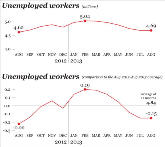
The ‘good news’ from before is actually worse than you realized: unemployment was actually higher than a better comparison point, August 2012.
“A chart acquires its meaning from the comparison.”-Vesa Kuusela
By not showing the entire seasonal period, you can easily be misled into drawing whatever conclusion the designer wants you to see.
So how do we find if seasonality is affecting our data? Follow the process of people who have money on it: stock traders.
How to interpret time series charts
I’m not offering any financial advice but instead wanted to point out the type of mentality you should take when thinking about time series charts like line charts.
People (usually) aren’t going to invest in stocks without first doing research, and they are looking for 3 particular questions:
Rapid shifts: Are there particular time periods where something changed rapidly?
Trends: Is the value on average going up, down, or staying the same during the time segment we’re exploring?
Seasonal patterns: How does this point compare to similar time periods or benchmarks?
Asking all of these questions is a vital part of interpreting and understanding a time-series chart.
Looking for outliers and sudden shifts:
One of the greatest strengths of visualization is seeing the data and assessing if there’s anything out of the ordinary with it. This could take the form of outliers, which might be from errors or other events:
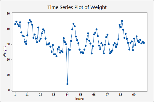
Or it can be from sudden and rapid shifts. If a stock trader saw something like this happen to stocks, they would want to figure out what caused this and if it affected any other industries or sectors.

After that comes overall trends in the data.
Looking for trends:
Once users get an overview of the data, they begin to zoom in to the data and look for trends in the data.
Are we heading on an upwards trajectory overall? How far up are we headed? This is an important question that people are familiar with, and we may use things like trend lines to establish this.

These two factors are not only common, they’re easily visible when you first glance at a line chart. However, the third question where people run into trouble.
Comparing the data over seasonal periods/benchmarks
One of the fundamental questions of data visualization is especially crucial to line charts:
Do you have enough data to make your point?
If the data hints towards seasonality, then the answer is probably no.
The average seasonality study for stock analysis uses at least 10 years of data, with some analysis looking at as much as 319 years of evidence.
When people’s money is involved, they tend to do a lot of research.
Think about the time scale involved with a chart: how many seasonal periods are displayed there? If there’s only one, you don’t have enough data to make a comparison.
To quote Vesa Kuusela, an expert on statistical charts, “A chart acquires its meaning from the comparison .”
If you don’t have a way to compare values, not only can you not find seasonality: you may not be able to make sense of the data at all.
And that’s a surefire way to be misled by a chart.
Based on the previous ski chart, it may seem like we should invest heavily in ski resort infrastructure in the fall since sales are trending up at a remarkable rate in November and December.
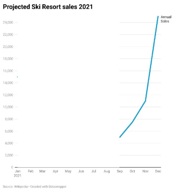
But gathering additional seasonal periods shows that this is a seasonal pattern, so we probably shouldn’t do something drastic.

Drawing the right conclusions
Interpreting time-series data can be tricky, given that many factors can influence trends and patterns in the data.
So one of the easiest things to do is to not take a single line in a line chart at face value:

https://gravyanecdote.com/formatting/designing-a-time-series-chart-for-seasonality/
Define what the seasonal period is, and then visualize the line chart in a way that showcases multiple seasonal periods to understand if seasonality plays a role.

It could be that seasonal patterns emerge, or it could also be that there’s no pattern at all.
But you won’t know until you answer the fundamental questions of time-series data.
Kai Wong is a UX Designer, Author, and Data Visualization advocate. His latest book, Data Persuasion, talks about learning Data Visualization from a Designer’s perspective and how UX can benefit Data Visualization.