


The power of the little (red) dot: encouraging users to explore further
How to signal that there’s more to the data than you can show

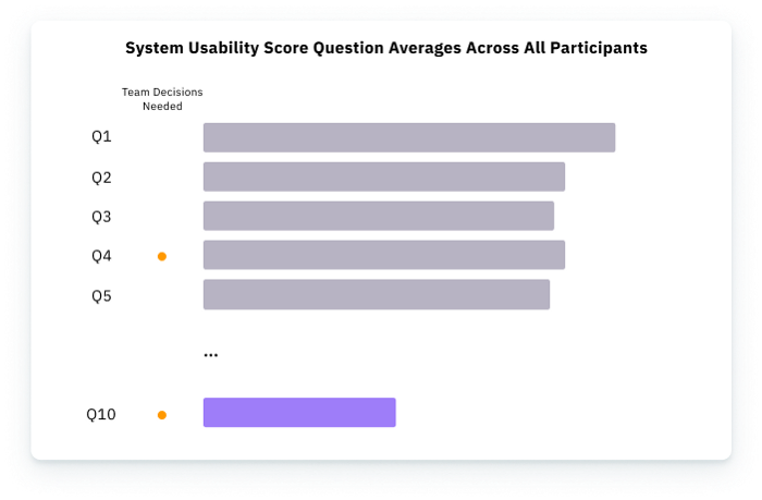
 and the bars. There are two red dots there, suggesting that Q4 and Q10 require some sort of team decision. This suggests further exploration (or explanation) of the data is needed.")
There’s an elegant solution to a visualization question I’ve had for a while, and it looks like a little red dot. Sometimes, due to space constraints, you might not show the entire story behind the data. This is when you consider using progressive disclosure through filtering actions.
Last week, I talked about how filtering data through interactions was a strength of interactive charts. By doing so, we could limit what we show our audience to something manageable. But doing so leads to another question: how do you get them to explore something further when the initial view isn’t that interesting?
Let’s explore the power of the little (red) dot and exploration.
How to signal that there’s more behind the picture
We know that users seek out information by Ben Shneiderman’s information-seeking mantra: Overview, Zoom, and Filter, then Details on Demand. But that mantra also highlights a problem. If users don’t see anything to catch their attention while doing an overview of the data, they won’t zoom in or look at the details. So how would you show that a question you asked was polarizing?
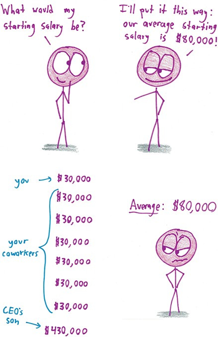
For example, imagine that in your System Usability Scale survey, your average is below 68. You go back to the raw data and visualize how all participants responded to each question on the SUS survey.

When you do that, you find that the majority of your low scores across all participants come from Question 10:
I think there are many things to learn before I can start using this system.
When you dig further into the raw data, that’s when you’re able to see the polarizing responses. Expert users feel incredibly comfortable with the re-designed system, while new users feel like it has a steep learning curve.
Reading over the user interviews, you find that new users don’t like the workflow rather than getting lost completing tasks. It seems like they’re asked to do things out of order rather than what they feel is most natural.
How can you visualize this data to get your team to explore further?
Just showing the bar chart with the averages loses the nuance that suggests what the problem is.
https://mathwithbaddrawings.com/2016/07/13/why-not-to-trust-statistics/comment-page-1/
If your team were to look at the bar chart, they might think the user needs help links or tooltips. Talking about averages without providing additional context can lead to partially effective solutions.
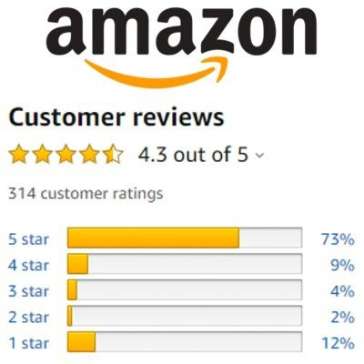
That’s part of the reason why companies like Amazon not only offer star ratings but show a breakdown of ratings for further context.
https://www.jumpfly.com/blog/anatomy-of-an-amazon-product-rating/
If you wanted to buy a product with a pretty high star rating, but it turns out there were a lot of 5-star and 1-star reviews, what might you do? You might explore the reviews further to understand the issues (i.e., is it a bad product, or does the description overpromise?) So how might you show that something warrants further attention? This is where we can take a page out of Business Intelligence and use their symbol: the little (red) dot.
Understanding the power of the dot for investigation
In The Big Picture: How to Use Data Visualization to Make Better Decisions, Steve Wexler talks about visualizations and Business Intelligence. Business Intelligence uses interactive charts like dashboards to convey information efficiently. Dashboards need to showcase a ton of information, encourage exploration if necessary, but often fit on a single page.
This is where the little (red) dot comes into play (it can also appear in orange for the color-blind blue-orange scale). The idea behind this is simple: this is a cue that you may want to investigate things further, as there may be something beyond what the data is showing you. And it tends to be used in two different ways. The first is to use it, something we need to pay attention to.
We often do this with color to choose contrast between categories.
But we can also do this by simply having a dot by the axis, showcasing that this is something to pay attention to.
https://learning.oreilly.com/library/view/the-big-picture/9781260473537/ch4.xhtml
This tends to be most useful for secondary visualizations, where it’s not the main focus of the dashboard. With this cue, we can see what we might need to pay attention to without overwhelming the user.
However, the main use of the dot (that may be useful to UX) is to provide additional context, which may be useful to show conflicting information (or exceptions).
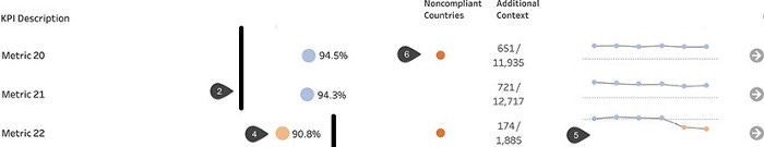
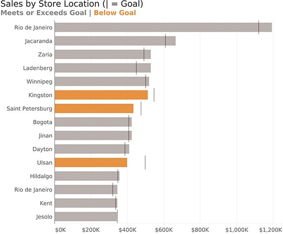
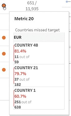
 has an orange dot under Noncompliant countries, but so does a blue dot that exceeded their goal.")
In this example, we can see 3 things. First, there is a black line, signifying what our goal might be. Second, things that pass this line are colored in blue, and those before the line are colored in orange. This is a simple way to noting whether or a metric has achieved the overall goal.
But there’s another dot to the right of it. Again, looking at the column header, we can see that this says non-compliant countries.
We can understand why the orange dots below aren’t compliant: it’s because they haven’t reached their goal. But why does the blue dot, signifying that they’ve reached their goal, have this mark as well? This suggests that we need to explore that datapoint further. For example, in a dashboard, you might use interactions like hovering or clicking to provide the specific details of why.
https://learning.oreilly.com/library/view/the-big-picture/9781260473537/ch9.xhtml
But even in a static visualization, this is a visual cue that requires further exploration.
And that’s the point.
Visualizations usually require exploration.
When you think about it, it seems foolhardy to try and capture everything possible within a single visual. There’s not enough space to highlight every interesting user finding, especially if it’s taken you weeks to capture it.
This is why a presentation usually accompanies static visualizations (and even dashboards) to talk about it. But if you don’t have that luxury, then your visualization needs to invite exploration. And one of the most important things to hint at is that there is something worth exploring further when the user is doing a quick overview of the data.
In that case, consider the power of the little red dot. It’s a suggestive way to your users that you might want to dig deeper into the data.
Kai Wong is a UX Specialist, Author, and Data Visualization advocate. His latest book, Data Persuasion, talks about learning Data Visualization from a Designer’s perspective and how UX can benefit Data Visualization.