


The most common mistake designers make when adjusting their bar charts

Photo by Luke Chesser on Unsplash
Sometimes, the data doesn’t exactly work the way you want it to.
When working with data, you might run into a fairly common problem: some values make it hard to fit everything on one graph;

When this happens, there is a common thing that many people are inclined to do to solve this problem: adjust your starting axis.
But it’s a mistake that will probably mislead your users.
Here’s why that’s a mistake, and 3 alternatives to doing that.
What to not do: Do not shift your starting value.
One of the most common mistakes a person can make when considering this problem is to shift your bar chart's starting value to something other than 0.
This is probably the only hard and fast rule for bar charts. To understand why you need to understand the purpose of bar charts.
Bar charts are often used for comparison, and what you’re comparing is the length of one bar compared to another.
Changing the starting point changes the bar's relative lengths, which can change the comparison points that people can make between the categories.

https://thenode.biologists.com/non-zero-baselines-the-good-the-bad-and-the-ugly/resources/
Other charts, such as line charts, might get away with not starting at zero, but the hard and fast rule is that bar charts can’t.
So what should you do instead?
Simple solution: Horizontal bar chart
One of the easiest things to do, in this case, is simply turning the chart 90 degrees and making it into a horizontal bar chart.

Horizontal bar charts are straightforward to read, and it follows the Z-pattern of reading that’s ideal for pages not centered on text.
This makes it easy to read the actual data and make sure we know what it represents and how we can compare it.
This also tends to be easier to scale, as the horizontal dimension for monitors, web pages, and most devices tends to be larger than the vertical dimension.
But what if your value is too large even for a horizontal chart? That’s when you can consider the reason behind the chart.
General solution: Rethinking the visualization message
At a certain point, the range of values is too different from putting on a single chart: making it hard to compare the smaller values or understand its scale and scope.

Source: https://peltiertech.com/chart-a-wide-range-of-values/
What you should do is consider what you are trying to say about the values. Data Visualization is more than pointing out information: you’re usually presenting this information to your team to get them to do something or learn something new.
As it stands right now, the only message that the data visualization is presenting is that January’s sales were big. That’s a nice piece of information, but it’s not really telling us a lot by itself. How might we improve on that message?
Maybe you want to highlight how we need to take more actions like the ones we took in January.
As a result, we might consider showcasing the magnitude of how January’s profits were bigger than the rest of the year’s sales combined. You might therefore consider a stacked bar chart to give an easier sense of scope.

Or, perhaps you wanted to highlight how January’s success put us on the fast track towards our cumulative sales totals of $2,000,000. Then you might consider something like a floating waterfall chart.

Thinking about what you can say, beyond whether a value is large or small, is a large part of making sure that the message you’re trying to tell is something that your audience cares about.
However, there is one more option we could go for, although it’s something that most will not understand: using a logarithmic scale.
Niche solution: Logarithmic scales
This is something that is often the wrong choice for most visualizations unless you’ve gone through the trouble of data analysis that suggests that your data is logarithmic.
On a logarithmic scale, the distance between variables is not based on the numbers but the percentage difference. Therefore, the distance between 10 and 100 is the same as between 100 and 1000 because of the percentage difference,
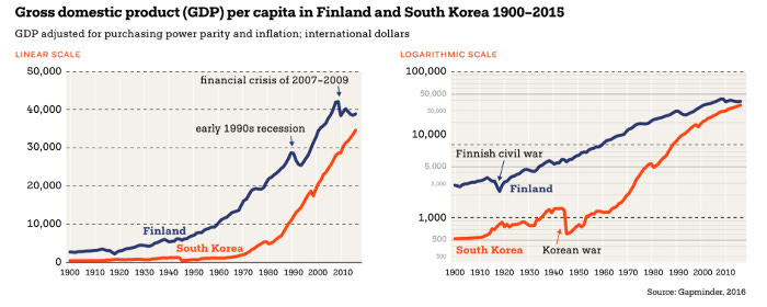
Source: https://datavizhandbook.info/
This is only usually used when you want to emphasize growth phenomena: economic or population growth, which often doesn’t fit well into a single scale. After all, if something is growing at a constant 3% rate over the course of 20 years, the values can be unwieldy.
However, to do this requires a particular set of circumstances: it requires you to understand how the data points can change over time and if the message you’re trying to tell is best expressed in a logarithmic scale.
Not to mention that we should only use this if the audience is technical enough to understand a logarithmic scale. However, for certain types of messages, it can be the right type of chart.
Rethinking your approach
One of the easiest things to do is adjust the axes to fit if your data doesn't fit into a graph.
But that’s also one of the easiest ways to mislead your audience. By changing the scale, you lose out on one of the most important visualization points: the ability to compare.
According to Edward Tufte, data visualization pioneer, data visualizations must be dedicated to addressing the heart of quantitative thinking: “Compared to what?”
One of the purposes for showing multiple values within a visualization is so that your reader can compare how the values differ and compare with one another.
Distorting the baseline distorts the type of comparison that your readers can make, which can easily mislead them into taking away the wrong conclusions.
So if you run into this issue, take a little time to understand a better method of fixing your visualization.
Kai Wong is a UX Designer, Author, and Data Visualization advocate. His latest book, Data Persuasion, talks about learning Data Visualization from a Designer’s perspective and how UX can benefit Data Visualization.