


Starting with Data Science

When I first started out learning Data Visualization, I did what most people would do: Search on Google for more information. I looked at courses, degrees, books, and other resources to learn Data Visualization.
But when I did, I noticed an interesting phenomenon: the majority of searches about Data Visualization led me to Data Science. It was typical for a lesson on Data Visualization to be embedded in a more comprehensive data science course, whether in books, courses, or certificates.
In retrospect, it shouldn't have been that surprising. Data Science is a field that uses scientific methods, processes, algorithms, and systems to extract knowledge and insights from structured and unstructured data. However, this was also one of the things that I didn’t understand: I didn’t know why Data Science and Data Visualization were linked so closely.
But after exploring the field, I found the answer why: Data Science doesn’t necessarily use Data Visualization because they love every aspect of create visuals: they do it out of necessity.
Much of Data Science's work is about climbing up that first step, from raw data to structured information. This work is often a large part of a Data Scientist's job simply because data volume may be massive. It's not uncommon for Data Scientists to be working with hundreds of thousands of rows of data as Big Data has become more widespread.
Because of this, not only do they have to create structured data: they also need to think of a way to present that data to their stakeholders. Given that Data Visualization is a way of representing data visually to highlight particular insights, it's a technique that becomes vital when you're working with larger amounts of data.
To illustrate this, let's look at an example we'll touch upon later on in this section: Anscombe's quartet.
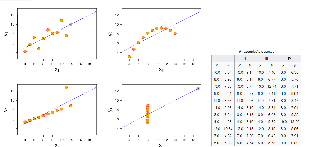
The dataset on the right might be well-structured data, but the data visualization on the left allows us to make sense of the patterns with the data. As a result, we are more likely to gain insights when well-structured data is visualized in this manner.
Therefore, I began my Data Visualization journey with Data Science: I earned the Applied Data Science Certificate from IBM while also reading books and other Data Science resources. I learned a great deal in not only how to turn Data into Information but why we should as well. In addition, I learned about the importance of structuring, how Design and Data can work together, and how to organize a dataset.
But one of the most important lessons that I learned came before learning a single thing: instead, it was a lesson on how UX Design perceives Data Science.