
Is the business process not capturing what users do? Create a UX flowchart
The surprising influence flowcharts have in changing business processes

 that goes up a hill. There is a sidewalk at the bottom of the hill heading to the right and university buildings behind, but the desire path goes through the grass and up the hill.")
More than any other chart in my work life, Flowcharts have probably had a greater impact on changing my projects' direction, focus, and design.
But I never gave them a second thought until I had to generate two flowcharts at the same time: it was only then that I saw the impact they had on both the user and business process.
The process to create one is often quite tricky. But it’s not because flowchart design is overtly hard: it’s the opposite.
Because you’re often developing flowcharts with other team members, there may be multiple overlapping flowcharts that you could generate.
So first, you have to figure out what flowchart you’re creating.
The two dimensions of flowchart types
I recently found myself creating not only the UX flowchart but also assisting in generating a business flowchart as well.
And learning how to make these resulted in me confusing the steps and language several times. The steps, scope, and objective of each chart are different.
To explain, let’s take a look at the difference between the two flowcharts.
Business flowcharts can be part of a larger process called business process mapping, which coordinates and maps different activities, data, systems, and people involved.
UX flowcharts focus on the user and their goals, mapping certain interactions, variations, and processes that users follow to complete tasks or journeys through a website.
However, this is not the only dimension of flowcharts you’re likely to encounter. There’s also another dimension that can emerge depending on the stage of your project: time.
Current (or as-is) flowcharts capture how the process is currently performed, based on user research, observation, interviews, and input from the team. This is an important step in making sure everyone knows how the process currently works.
Future (or to-be) flowcharts capture how we will improve the process based on the current system and improvements. Based on research, testing, and evaluation, this documents what the team believes to be the better process for the project.

To explain the difference between all of these flowcharts, imagine you’re generating flowcharts while re-designing a badly designed product.
Your team will start by creating a Current Business flowchart because they need to capture the process of what’s happening today. The steps outlined here are the ‘official process’ and may be based on technical, legal, policy, or other external factors.
UX then creates a Current UX flowchart after doing user research and interviews. The purpose is to understand where users are running into issues along the way and how they may be differing from the ‘official process.’
After iterating on design through user testing and evaluation, UX can create a Future UX flowchart, which documents an improved user process. This essentially takes in the changes you’ve made based on the prototype and maps it to an improved workflow.
After looking at the proposed UX changes, while also coordinating the Business backlog and other documents, the team can create a Future Business flowchart, which creates a new unofficial process that they expect will lead to improvements.
You may only know about the business flowcharts, as UX flowcharts may often be ignored in favor of things like customer journey maps.
But creating a UX flowchart allowed me to persuade my team to make some fundamental changes that greatly impacted my project.
Because it addressed two key questions in my user research visually: where are users running into issues, and why?
Visualizing your user’s process
One common usability issue that I’ve faced in the past is what I call the ‘Notepad’ problem.
This problem occurs when the navigation isn’t flexible enough to support the types of information that can come in. A person may call in assuming that the other person knows all the details of why they’re calling. Or they may not remember all of the specific codes and shorthand to fill out a form.
The official process was for them to follow the order: they would set up training and provide user guides or links that the person was supposed to read through. That was supposed to happen even if there was a caller on the line.
The actual process that users followed was that they would open up an external text application (usually Notepad) and either type in or refer to data stored there. That was a problem for many reasons (not least of which was security/PII issues).
This is an important user research finding, but it’s not part of the official process. What’s the best way to showcase this to your audience? You could put it into a research presentation, but the far more effective way is to illustrate this with a UX flowchart.
The reason for this is, with a few small design tweaks, the problems with the process will stand out with your audience.
How to convey issues with flowcharts
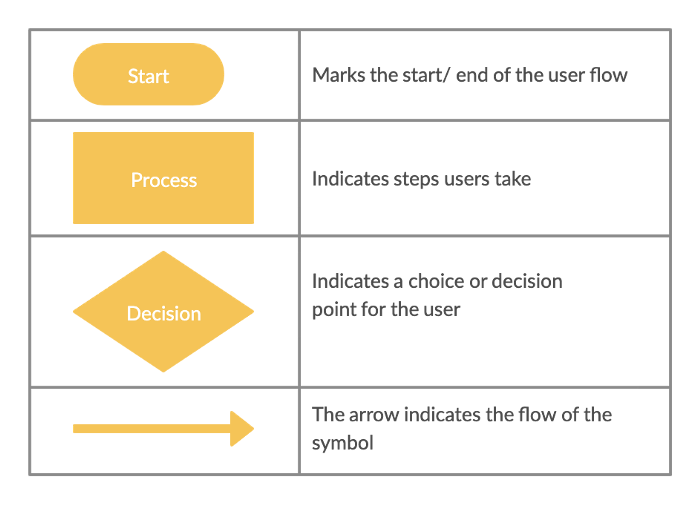
Before we start, here’s a quick primer on a number of the basic shapes within flowcharts.
https://creately.com/blog/diagrams/user-flow-diagram/
Just by using these 4 symbols, you can construct a basic flow chart, but there’s one thing you have to keep in mind when you make a Current UX chart:
You are capturing the current process, even if it is unclear.
As Designers, our job often involves designing with as much clarity as possible.
But our users may take a complicated, roundabout method of dealing with an issue. This means that the flow charts should reflect this rather than an idealized version of the current process.
Keep in mind that flowcharts are living documents: while the first version may be a mess, as the project team makes decisions to address issues, it will become clearer.
However, you can make several design decisions to avoid confusion about what the issues are.
The first comes from giving a proper description.
Name, date, and description

One of the most basic things you do is make sure the flow diagram has a name and description that fits the diagram.
It may seem like a simple step, but the number of times I (or someone else) referenced something on the old version, or the Future instead of the Current scenario, was what forced me to be proactive about labeling.
Having a “Current” or “Future” label, along with labels such as ‘Date last Modified,’ is a way to get people to understand exactly what this diagram is supposed to represent.
As you conduct further user research and testing, this can be expanded upon: Adding things like a user persona and a use case scenario once you understand it can bring additional insight and clarity to the subject.
Color and contrast

Many tools, like Microsoft Visio, add in additional colors such as Blue or Red to make the steps easier to read.
However, one of the more important things to do is provide enough contrast to highlight where users have problems or otherwise alter the workflow. The point of a UX flow, in this case, is to highlight where the process breaks down or runs into issues: being able to show that through color is a quick and easy way to do that.
User-focused annotations
, have more context. An arrow pointing to the “No rectangle” says: “Users are forced to quickly find somewhere else to record observations out of order.” The other red rectangle says “65% of cases don’t follow the exact process highlighted by policy.”")
User research findings can get lost in the shuffle sometimes. You may talk about dozens of important research findings in a user research presentation: it’s not surprising if your audience forgets one or two of them afterward.
So bringing up important user research points in the context of particular steps of the process can be a great way to review why users found something particularly problematic.
Enter the user-focused annotation: while you often don’t have enough space to explain everything, summarizing key points in this context can not only reinforce your user findings but explained why the user might be deviating from the official process.
Best practices (by asking others)

I have to admit, I don’t know much about best practices for flowcharts, but I might have lucked out by mapping out the steps in this way.
The project manager looked at my diagram and asked why we were starting with a decision (“In order?”). I’m not sure if that was against some best practice, but it was probably one of the major factors in getting the team to support flexible navigation.
Showcasing what you have while emphasizing that this is the user perspective can show your team where the divide is between the user and business needs and may influence the process.
Flowcharts can influence the process
Flowcharts are not always super engaging: in fact, you may have sat through more than one boring meeting discussing the steps of a flowchart.
But it can be a surprisingly effective way of showing how the business and user flows may diverge and what to do about it. It’s also a great way to reinforce user research findings and make sure they don’t get lost in the mix.
So don’t forget about the common flowchart: by creating a UX flowchart, you can help showcase your user’s process and make it a part of the conversation about determining how the team should organize your product.
Kai Wong is a UX Designer, Author, and Data Visualization advocate. His latest book, Data Persuasion, talks about learning Data Visualization from a Designer’s perspective and how UX can benefit Data Visualization.