
Intimidated by Google Analytics? Just learn the shape of the graph
Gain valuable user insights by glancing at Data Visualizations


Photo by Leeloo Thefirst: https://www.pexels.com/photo/watching-stocks-on-mobile-phone-7873553/
If you can read a bar chart, you can learn much about your users quickly.
As you may know, I’m a massive advocate of data-informed design: I even wrote a book about it. Data is often an untapped resource for user research insights that can provide a Birdseye view of a project, our users, and where they may be struggling.
One of the most accessible data sources, in many cases, is Analytics. Many tools like Google Analytics provide aggregated data from your users in real-time to show you who your users are, how they might be using your site, and where they are running into problems.
Even so, many UX designers may not be that familiar with analytics. Many designers don’t like to work with numbers, and more importantly, going to a place like Google Analytics may be a designer’s first experience being a secondary or tertiary user.
But despite what businesses might say, numbers aren’t the sole source of truth: they are just a computer counting things without context.
For example, is it good or bad that our page views doubled? The number sounds good, but it also could be that one of the links most users click refreshes the page instead of taking them where they want to go. This is why we need user research to learn more about our users and why it can be valuable for designers to know about Analytics to inform their design.
Taking the objective (but context-less) data that computers gather and making sense of it with user interviews, user testing, and more allows us to get the complete picture of what is happening.
But we often don’t need to learn how to crunch numbers to do so. Instead, we need to learn to read bar and line charts for things like Google Analytics.
Understanding graph shapes
Analysts aren’t particular people that love to look at numbers: they prefer to look at data visualizations, just like the rest of us. So most modern programs don’t showcase their analytics in pure numbers: they use things like bar and line charts.
So if you can decipher patterns based on these charts, you don’t need to worry about the numbers too much. Instead, you will have a general idea of what is going on. So here are a number of the most common chart patterns you might identify.
(All of the following sketches come from Joel Marsh’s “How to design with Data”)
General Graphs
General Trend:

This is one of the most straightforward patterns that we might expect. If there is slow and steady growth, you expect things to rise as you go from left to right. Similarly, if there is a slow and steady decline, you expect things to fall from left to right.
This type of graph tends to inform the basics of user research. For example, if more users are using your product, you may want to ask questions about what motivated them to start using the website. Similarly, if your users are slowly declining, you might want to identify some of the main frustrations causing users to quit.
Checking these graphs is often also useful for benchmarking. This is the process of comparing numbers or metrics for evaluation. For example, if numbers were going down, but then you did a website redesign, and numbers are going up, this is one of the easiest ways of showing that UX made a difference.
Random/Unexpected/One-time Event

This is what we might expect if there’s a one-time event like your start-up went public, you ran a weekend ad campaign, or other news that will generate a burst of temporary traffic. But instead, it’s usually shown as a spike that quickly descends.
Sometimes, these things are unexpected or random and hard to use with user research. However, you may be able to use this as a negative research point. For example, if your team believes that we just need to have sales instead of redesigning our core user experience, you might show how sales may impact things once, but the overall trend is still the same.
Predictable traffic

More mature sites are going to have a clear pattern and visits. So, for example, if your users are children who go to school or office workers who work Monday through Friday, you might see more traffic on those days.
This is not that insightful, but it can give you additional context on when and where to deploy your research study. For example, if you were going to deploy an A/B test, you would want to deploy it for an extended enough period that one subset of users doesn’t bias your study.
Structured behavior Graphs
This is the other type of chart you’re likely to see when looking at Analytics: This shows what people are doing.
Here are a few things that you might see there.
Exponential/Long Tail

Exponential or long tail graphs show strong biases toward certain behaviors or decisions due to the nature of the data that they are expressing. For example, we might expect most users to click once on the site, fewer users to click twice, and even fewer to click a third, fourth, or fifth time.
We might consider this the default pattern for this type of graph, which is often the pattern we expect to see for most things. Of course, this in itself is not that useful for user research, but the disruptions of this pattern can yield a lot of insight.
Exponential with unexpected order

If your exponential graph is out of order, your users have different priorities than you. this is one of the most exciting graphs and is often probably the basis of a lot of user research. If users are not clicking where you want them to go, there is one question: why?
Is a specific page poorly designed, causing them to spend more time on a page? Are certain things more appealing to users, which means they break from the order? Seeing this should immediately cause deeper investigation because, often, it’s either the usability or a technical blog causing this to happen.
Exponential with power users

Sometimes, a small group of people is often doing a lot. So this sort of slide sheet that you might see with the long tail is similar, but there is a lot of engagement or bump to the far right of people who are very loyal, active, or spend a long time on the site.
This is a good thing, and you should want to learn more about it: something motivates a subset of users to spend more time, effort, and money on your site. So you should figure out why and do more stuff that motivates users.
Exponential with a conversion problem

While there is an expected drop-off between the exponential bars, a significant drop between the first or second bars (usually) indicates that there are problems with conversion.
This also tends to be a problem that UX can fix: there is some barrier that users face when they’re trying to go smoothly from one page to the next, which usually results from a page being poorly designed, the following steps being hard-to-find, menu items not being labeled correctly, and more of the like.
In this case, you want to identify a significant drop-off between the two pages and make sure that they are related. After all, this pattern isn’t just found when going from page to page: it’s also found in places where the pages are unrelated.
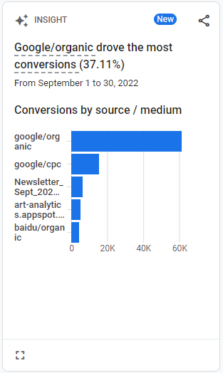
Source: https://analytics.google.com/analytics/web/#/p213025502/reports/intelligenthome
Understanding the shapes of graphs can provide a lot of insights
I get it. Google Analytics is mainly meant for people like business or data analysts who live in a world of numbers. You might feel like it’s not your job as a designer to understand that.
But honestly, you don’t need to know that much beyond the shape of a graph to get insights relevant to what you do as a UX designer. The main thing that you’re trying to get from analytics isn’t a solution: what you’re trying to get from analytics is a better understanding of the problem.
You want to understand the big-picture overview of what’s going on with your users and the website so that you have a clear idea of where to start your user research or who you might want to interview. That’s why understanding the charts you find in Google Analytics might help you immensely.
So if you’ve ever been intimidated by analytics data or data as a whole, spend a little time looking at and trying to understand data visualizations. It might give you the level of insight you need without confusing you with the numbers and details.
Kai Wong is a Senior UX Designer and a top Design Writer on Medium. His new book, Data-informed UX Design, explains small changes you can make regarding data to improve your UX Design process.