Improve UX research presentations with 3 minor writing tweaks
A quick guide to better user research presentations

To be a great design storyteller, you must focus on your words. Well-designed presentations with precise wording can be a shortcut to storytelling.
After presenting user research for over a decade, I've noticed that the words on my slides often are just as critical as my points.
You might have observed this as well. While becoming a great design storyteller may involve practicing complex skills like public speaking, engaging wording can improve any presentation universally.
It starts with what you put at the top of each slide.
Descriptive titles and wasted opportunities
How many of you create slides with titles like these?
Introduction
Research Methods
User findings
etc.
These are called descriptive titles, which introduce the topic. There's nothing inherently wrong with using these titles, but they're often a wasted opportunity to help clarify your points.
The title is the first thing audiences encounter, and it can be crucial to capture their attention (especially if they're new to UX). This is why taking that extra step of thinking about and incorporating key takeaways into your titles can make a crucial difference.
Cole Nussbaumer Knaflic, author of Storytelling with You, suggests that there are two important places to do this:
The Presentation title slide
Takeaway title slides
Presentation titles are about offering a quick preview
The presentation title slide should be a quick preview of what you'll discuss, designed to engage the audience.
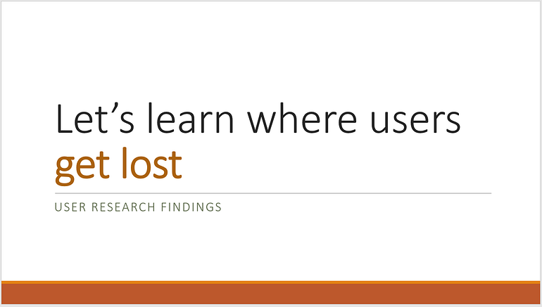
For example, rather than just calling your presentation "User Research findings," incorporate your main point. For example, if most of your user findings were about navigation and task completion issues, you might add a title like "Let's learn where users get lost."
This makes it clear what this presentation will be about and helps you organize your big ideas.
You might be saying, "Well, I have a bunch of user findings, and I'm not quite sure what to focus on." Here's the bad news: if you have no idea what you want your team to address, neither will they. More importantly, you probably do have some idea of what to focus on.
If you're providing them with 10 points of usability issues, would you be okay if they pulled out a dartboard to figure out which 3 to address? Probably not.
A presentation title like this doesn't mean you have to hide any issues unrelated to this idea completely; it just means you're prioritizing these issues.
This is where the other title comes into play: takeaway titles.
Takeaway titles provide an overview of your audience's needs
Imagine that your presentation is going to be referenced later on. People will dig through your slide deck to find the points you referenced and show them to others.
Could they quickly find the points they want to reference, or would it be a struggle?
That's the idea behind takeaway titles. These aim to capture what this slide is about at a glance, with the bullet points underneath being things in more detail.
This leads to the next important issue.
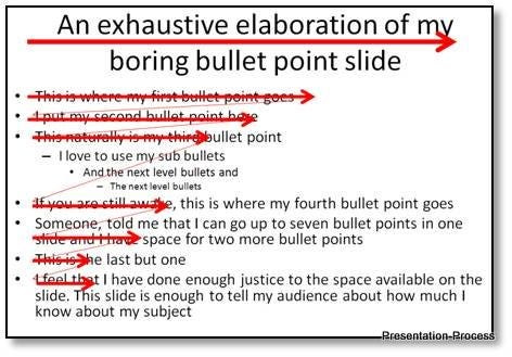
Your bullet points are not a teleprompter
One of the first and most common mistakes is that many write everything they need to say on the slide. As a result, they read the text directly off each slide, leading to boring presentations.
Audiences will read faster than you talk, so they will quickly grow tired and give up on your presentation.
If you need to write down what you will say (i.e., it's hard to memorize), first know that there's a "Notes" view in Powerpoint that's invisible to the audience but can help you.
What should you include instead? They're an overview of your discussion points that piques the audience's attention and explains where you will go next.
Lastly, you may want to apply these ideas to one of user research's most potent tools: user quotes.
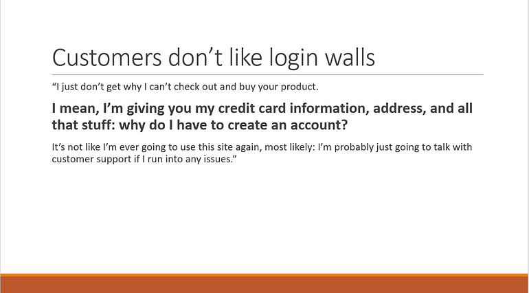
Emphasize your takeaways from user quotes.
User quotes are often a persuasive argument, straight from the user's mouth, that you may want to include in presentations.
They're some of the most compelling ways we have as designers to convince the rest of the team to follow our advice. Unfortunately, they also tend to become large blocks of text.
As a result, it can be tricky for the team to focus on what you want to pay attention to. The solution, then, is to create a visual hierarchy around the parts of the quote that you want to emphasize.
Use a relevant slide title.
One of the easiest things to start with is to ensure that the title accurately reflects what you want them to gather from the quote. That way, even if they don't read the quote, they know what it's about.
Create a visual hierarchy to draw attention to the specific wording
If there's one sentence, in particular, you want them to pay attention to, consider using selective highlighting to draw their attention to it.
This doesn't just apply to user quotes but to any visualizations you want to create. Ensure that the elements are highlighted correctly in a way that stands out to the audience.
This extra work can help do the heavy lifting for your audience, which is often why this work pays off.
However, there's one last thing to emphasize at the end.
Audiences don't read: they scan. Titles help to get that idea across.
Design storytelling requires the right words on the page
Why do we need to pay such close attention to the words in our presentation?
It's for a straightforward reason: Audiences don't read. They scan.
We often design websites with this core idea: why should our presentations be any different?
Part of telling a story through design is ensuring that our users (or audience) can follow where we intend to go. If we fail to do this, this often leads to workflow issues or user friction.
By applying that same detailed eye (and desire for ease of use) to your user research presentations, you can improve your presentations to become more engaging and persuasive.
While writing is not everything you need for design storytelling, ensuring you won't lose your audience within the first few slides is crucial.
Doing so can allow you to establish common ground and help your audiences understand the bigger picture around your user research.
Kai Wong is a Senior Product Designer, Data-Informed Design Author, and Data and Design newsletter author. His new free book, The Resilient UX Professional, provides real-world advice to get your first UX job and advance your UX career.


