


How user empathy can make even bar charts more insightful
The two-word data visualization revolution that changed the way I think about bar charts

Source: Lauren Manning on Flickr
Bar charts are the most common, least problematic, and usually dullest data visualization solution.
They’re usually suitable for nearly every situation: their visual cues support any data and context. You’ve probably seen a bar chart this week or generated one if you’re working with data.
You also probably forgot about it until I reminded you.
Visually, there’s nothing problematic about bar charts: they are accurate and standardized charts used to compare between different categories.
But because bar charts are assumed to be “the default chart”, sometimes they’re generated without thinking. And without any thought put into the message you’re trying to tell, then the information is dead on arrival.
But it seemed like bar charts would remain the most effective way to convey data.
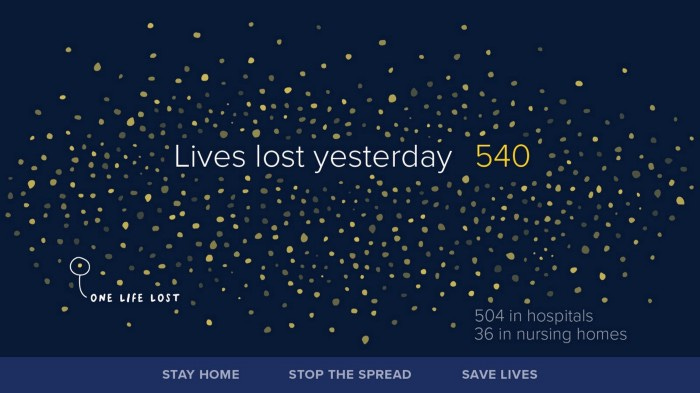
But last year, there was a data visualization revolution that challenged this type of thinking: The stay-home revolution.
The Stay-Home Data Visualization revolution
Last year, there was an urgent need to convey public health information to the general public. The things that needed to be conveyed were more complex than normal information, such as healthcare system capacity and social distancing.
This resulted in a widespread data visualization effort towards getting people to stay home and social distance. To convey messages, governments presented data in the standardized data formats that we were all used to, such as bar and line charts.


Source: https://data.sfgov.org/stories/s/dak2-gvuj
These were clean charts, which were well-formatted, nicely aggregated, and presented the data clearly. But they weren’t the most effective data visualizations produced during this time.
Medical professionals, such as doctors, made simple line graphs that nevertheless went viral with their message.

Others used bar charts within different contexts, such as showing the magnitude of an issue versus comparing categories.

https://www.nytimes.com/interactive/2020/04/03/us/coronavirus-stay-home-rich-poor.html
But these standardized graphs only appealed to certain audiences. Because these were messages that needed to appeal to a wider audience, Data Visualizers often took non-standard ways to appeal and communicate to audiences.
Giorgia Lupi, Data Visualizer and fashion designer used beeswarm charts to convey the loss of scale, even if it was less accurate than bar charts.
Giorgia Lupi’s presentation tracking COVID-19: https://www.pentagram.com/work/covid-19-charts/story
Juan Delcan and Valentina Izaguirre went even further, eschewing charts in favor of metaphors to present the same message.

https://news.artnet.com/art-world/artists-viral-match-video-coronavirus-1805979
Were these visualizations as clear at accurately presenting information as bar charts?
Not at all, but they were more effective and impactful for their audiences.
Why? They were designed to garner empathy by understanding their users.
Visualizations are part data, part audience
Based on the data you’re encoding, Bar charts are one of the most efficient and effective ways to present information.

But it’s not always the most effective method for your audience to decode your data.
While they may have the data literacy to read the charts, we know that audiences don’t read as UX professionals: they scan.
If they scan through your chart and nothing really pops out to them, you may lose their attention before they spend any more time looking into it. Technically, this counts as reading over your chart: they just haven’t paid enough attention to try and understand it.
So if you’re going to create a bar chart, spend some time thinking about the audience by asking yourself these questions.
What you should ask yourself before creating a bar chart
Why is a bar chart the best fit for my visualization?
How you design your visualization is usually based on the goal of a project, your data story, and your audience. Bar charts are designed to showcase data in different categories to allow for easy comparisons between them.
Suppose your goal is related to this, great. But what you have to ask is what type of comparison you want to make and why bar charts are better than the alternative. For example, if you’re trying to give an overview of your performance across different time periods, you could consider a line chart.

Bar chart vs. line chart over time
Or, if you’re trying to compare between only two categories sometimes, simple numbers may be another option.

Simple numbers vs. bar charts
The purpose of this isn’t to get you to stop using bar charts: instead, it’s to get you to think about the reason that you’re using a bar chart in the first place.
Bar charts may be the default choice, and sometimes it’s the only choice, but you should still think about the alternatives to ask yourself why you’re creating one in the first place. This becomes increasingly apparent when you think about the way that your audience will view your bar charts.
What’s the first thing my audience will notice?
When it comes to bar charts, where is your audience going to be looking? To engage an audience with a chart, you have first to make sure you’re trying to draw your attention to the chart itself. One weird trend that I’ve seen around bar charts has been that the most prominent thing on a chart isn’t the data: it’s the title.

While doing this can sometimes be a good starting point, if that’s the only visual cue engaging your audience, you’re missing the point of a data visualization. Using pre-attentive attributes such as color, text annotations, and Gestalt patterns to draw attention is vital in getting your audience to stop scanning and start focusing on what you’re trying to say with a visualization. You may not be able to answer this question on your own, but it’s an easy thing to learn as you develop your chart. Present your chart to a coworker, friend, or acquaintance and ask them the first thing they see (or do a think-aloud test if you have time). You may find that some visual cues are guiding the user’s attention more than others.
What will your audience take away from the chart?
It would help if you also thought about the desired impact of your visualization. One of the disadvantages of using standard charts is that they often fail to have an impact.
“We’d work for months, and [our reports] would be read by 10 people. That was frustrating.”
- Yasmin Gagne, Fast Company
Not every chart has to change the world, but charts need to have a hook to engage the viewer and get them to remember something. To talk about this, I want to mention dashboards again. The purpose of dashboards is to glance at multiple visualizations to understand (and evaluate) information that’s presented.

For example, if this were a dashboard, I’d list the following points as information I’ve gleaned:
· There are 3 bad steps in the workflow
· Our NPS is horrible
· We spend a lot of time on one page
· There’s a conversion funnel problem
I mention this because dashboards are often information you quickly glance at to learn something fundamental, and you have to explore the data to learn more.
If your bar chart has the same takeaway as the dashboard, then it’s a failure.
You’re focusing the audience’s attention on one specific visualization: What else can you say about that subject?
These are questions you might expand on if you were focusing on a bar chart:
· Why are users spending this much time on the page?
· When did this start?
· How is this affecting other things?
· How severe is the problem?
Small changes create better bar charts.
The bar chart will remain the most common chart for a reason: it’s a versatile chart that we can use in nearly every visualization situation. But that doesn’t mean that all bar charts are great: because they’re so common, your audience will often forget about them the moment they disappear.
I’m no different: I was looking for a particular bad bar chart to analyze from a past presentation, but I couldn’t even remember where I saw it. But by asking small questions when you’re creating one, you can create bar charts that your audience won’t soon forget.
Kai Wong is a UX Designer, Author, and Data Visualization advocate. His latest book, Data Persuasion, talks about learning Data Visualization from a Designer’s perspective and how UX can benefit Data Visualization.