How to design to alert users without overwhelming them
Information is cheap, but attention is expensive

“One of the biggest problems we have to be aware of is alarm fatigue.” That warning from a product manager became my introduction to scalable design.
The problem was deceptively simple: a single alert might be well-designed, but displaying ten of them on one screen would quickly overwhelm users, causing them to miss critical information.
Here’s a quick test for your interface. Show it to someone for two seconds and ask: “What needs attention first?”
If they can’t answer immediately, or if they point to something that isn’t actually urgent, you have an attention problem.
This isn’t just about aesthetics. It’s about function. When a technician sees 20 alerts that all look equally critical, each marked red with “high priority,” how do they distinguish between “check this when you have time” and “run down the hall right now”?
Learning scalable design isn’t just about presenting information. It’s about presenting information in an environment where attention is scarce.
To understand why, we need to talk about airline pilots.
Human Factors, Arousal, and a U-shaped curve
To better understand how to manage attention, we need to discuss a concept called arousal, which originates from the field of Human Factors.
The concept originated from a simple but critical question that much of Human Factors was built on (Yerkes-Dodson Law):
What is the optimal display for airline pilots?
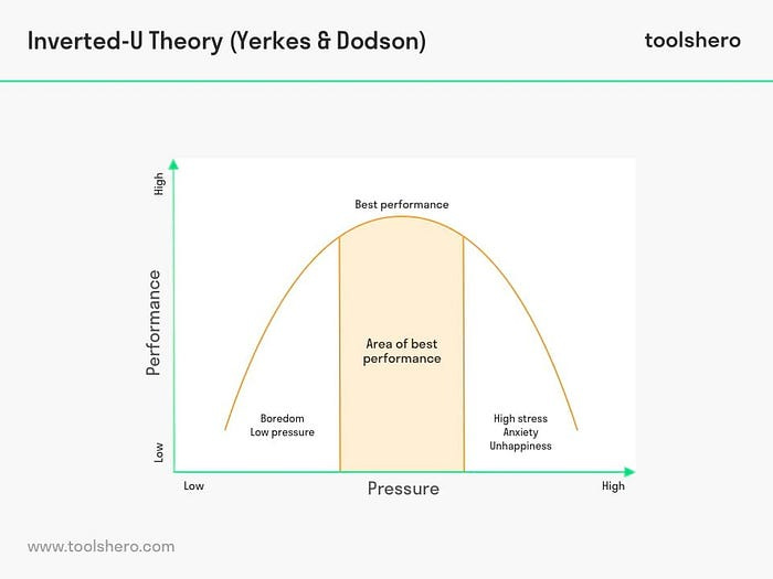
The problem pilots faced was twofold. Too little arousal, and you get a bored and distracted pilot not paying attention because it’s too easy to fly a plane.
Too much arousal? That’s a pilot overwhelmed by dozens of flashing lights demanding attention, unable to distinguish what actually matters.
The Yerkes-Dodson law, which was used with pilot cockpits early on
Both extremes lead to poor performance. The sweet spot is in the middle, where the person is alert and focused without being overwhelmed.
If you grew up using the internet in the 2000s, you’ve lived through a design disaster in managing arousal. Flashing banner ads covered every inch of screen space, each one desperately trying to capture your attention.
The result? The entire site became unreadable. Your eyes didn’t know where to look. Nothing got your attention because everything was screaming for it.
This is the fundamental challenge of designing for attention in B2B and complex systems.
We can be intentional about certain UI elements, such as typography, headers, and other visual elements on a website, to avoid attention overload.
But how do we design an alarm, notification, or more that might show up 100 times on a page?
That’s not even mentioning the other constraints you’re likely working with.
The Real-World Constraints that make this harder
Here’s what makes this challenging: you can’t just redesign everything from scratch. In many domains, the visual language for urgency is already standardized.
Green means good, red means bad (ISO standards for network monitoring)
Color-coded severity levels (industry-specific standards)
Established terminology (like “Code Blue” in healthcare)
These standards exist for good reasons, like consistency across systems and organizations. However, many of these standards predate UX input, which creates numerous issues.
A row of red and green status lights is useless if you’re colorblind to red and green. Likewise, using a “Yellow” warning label is likely going to make things harder to read.
The design challenge isn’t to ignore conventions. It’s this: How do you create a hierarchy of attention while respecting conventions and ensuring accessibility?
The answer: treat attention as a scarce resource that must be allocated strategically across your entire system.
To do that, you need to understand the difference between alarms and anomalies.
Your Framework: Alarms vs Anomalies
Before you can solve the attention problem, you need to understand what’s competing for attention in the first place. Not all information is created equal, and treating everything the same is what got you into this mess.
As Greg Nudelman notes in his work on UX for AI, two fundamentally different types of information demand different responses: alarms and anomalies.
Alarms are about urgency. They say, something needs your attention right now, and you need to take action. This could be a warning or a critical issue, but the key is that action is required. Examples:
“Battery at 10%”
“Payment failed”
“Server down”
The user should stop what they’re doing and respond. Even for warning-level issues, the action might be as simple as quick reporting or acknowledgment, but action is required.
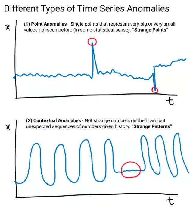
Anomalies are about investigation. They’re about saying, “This data point looks odd and might be worth watching.”
Sometimes anomalies turn out to be more critical than alarms (especially in fields like Finance), but often they’re nothing. The action isn’t to fix the thing directly. It’s to learn more and dig deeper. Examples:
“Traffic spike at 2 AM” (Could be routine maintenance, could be a security breach)
“CPU utilization doubled” (Might be normal for this time of year, might indicate a problem)
“This stock just jumped 20 points (could be a breakout pattern, or could be the first few minutes the stock market is open)”
A single anomaly, such as a single CPU spike, may not be significant on its own. What matters more is if a pattern develops, especially with multiple spikes in the same minute.
This is why the count of anomalies within a time period often matters more than individual occurrences.
https://www.uxforai.com/p/point-anomaly-detection
Understanding this distinction is crucial because alarms and anomalies require different levels of attention and awareness.
Alarms need to capture attention immediately. Anomalies need to be noticeable without being disruptive, because they invite curiosity rather than demand action.
This is how you begin to differentiate in an attention-scarce environment.
Three Strategies for Managing Attention
So how do you design for and manage attention? It comes down to small choices many times.
Layer Multiple Signals Beyond Color
Don’t rely on color alone. Create distinct visual treatments that work together:
Alarms (immediate action): Red background + warning icon + bold text + animation
Warnings (action needed soon): Yellow border + alert icon + medium weight text
Anomalies (investigate when ready): Blue badge or subtle indicator + regular weight text
Info (awareness only): Gray text + info icon + regular weight
This layered approach, where information isn’t conveyed solely with color, doesn’t just avoid accessibility issues. It also means that users can distinguish urgency through shape, weight, motion, and pattern — not just color.
Each additional signal provides another way to quickly grab attention without running into a lot of the constraints they typically have.
Use Pattern Disruption Strategically
When everything follows the same pattern, nothing stands out. When one thing breaks the pattern, it immediately captures attention.
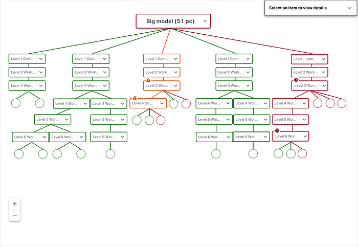
I’ve talked about this previously, with the concept of the ‘red dot’. Something as simple as adding a single red dot, breaking consistency, can draw attention quickly and break that pattern.
Warning symbols draw attention to specific levels in a large diagram
It tends to be more helpful in drawing attention to ‘anomalies’, as the behavior typically associated with this is exploring something further. However, a simple pattern break can be instrumental in addressing issues like menu items that are ‘collapsed’.
Design multimodal pathways based on thresholds.
Not everything that needs attention requires immediate attention. This is especially true for anomalies and lower-severity warnings.
For example, you might create different, redundant pathways, depending on the severity of alarms. If a user is encountering a “Critical alarm”, they might not just be able to see it in an application: they might also be emailed that there is a problem.
You probably have seen dramatized versions of this in pop culture:
Critical alarm: “Code Blue, Critical alert, etc.”: Everyone’s hospital pager goes off, people announce it on the loudspeaker, and there’s a siren that’s blaring
Warning/Anomaly: “Paging Dr. X”: perhaps someone gets paged or there’s a small reminder to check your messages
The idea is at a certain point, what may just exist in a single channel becomes an omnichannel issue, so that the user is aware of the issue.
Careful consideration of the threshold for this alert is necessary, as it is one of the most common methods of alert fatigue, but it can also provide all the necessary context for critical issues.
This respects the user’s attention budget while ensuring nothing gets missed.
Anomaly Detection is said to be a highly valuable skill
Understanding attention management isn’t just good UX practice. It can also be a competitive advantage.
Greg Nudelman argues that one of the most common AI use cases we may see in the future is anomaly detection. This is for several reasons:
AI’s can’t self diagnose (i.e. see anomalies in their system) many times
Humans are better than machines at making judgment calls around pattern recognition
Designing for attention-scarce environments is becoming an increasingly common issue.
Managing attention isn’t about making everything more transparent, brighter, or louder. It’s about recognizing that human arousal is a limited resource and spending it wisely.
It’s about having the credibility to push back when stakeholders want everything to be “critical”, and the framework to explain why that hurts users.
The best designs create a clear hierarchy where users can instantly distinguish between “act now” (alarms), “investigate later” (anomalies), and “good to know” (information), without overwhelming them or requiring training to ignore your signals.
This is why design may have a bright future in complex fields: it often involves helping users find the needle in the haystack without getting fatigued by all the hay.
So, if you’re designing for users who split their attention, understanding arousal (and how to design for it) may be the lessons you need to take to make a bigger difference.
Want to understand how to draw attention to your work? I teach a course on how draw attention to the value of what you did. 5 days left to enroll.
Kai Wong is a Senior Product Designer and Data and Design newsletter author. He teaches a course, Data Informed Design: How to Show The Strategic Impact of Design Work, which helps designers communicate their value and get buy-in for ideas.


Outstanding framework for thinking about alarm vs anomaly design. The part about treating attention as a scarce resource that must be allocated strategically is what most systems get wrong. Worked on a monitoring dashboard once where everyything was marked urgent, and predictably nobody paid attention to actual emergencies. The layered signals approach (color + weight + motion + pattern) feels obvious in hindsight but rarely implemented.