
How to clean quantitative user data — a visual guide
How learning 100 lines of code can save you hours of fixing user data spreadsheets

.")
Learning to code may seem incredibly intimidating, but earning just 100 lines of code can save you hours of fixing your user research data.
I’ve recently been spending a lot more time with the quantitative side of user research. Between surveys with 100+ participants, tracking metrics across multiple design iterations, and working with Google Analytics, I’ve gotten to experience the ‘joys’ of working with real-world datasets.
These joys include reading Excel spreadsheets until my eyes crossed, trying to track down missing values, and a whole lot of inconsistencies across multiple design iterations.
But after messing around with the typical tools we might use as designers (like Excel, note-taking programs like Reframer, or Visualization tools like Tableau), I’ve realized that using Python is often the best option to quickly format and make sense of the data that I’ve collected. But telling designers to learn a coding language can often be a hard sell.
I know from experience that many UX Designers have a mixed range of emotions towards coding, particularly fear.
But learning just 100 lines of code can save you hours or even days' worth of time in your analysis process.
So here’s a visual guide to understanding the code that will provide you with high-quality user research data.
But to do that, we first need to differentiate between data cleaning and data analysis.
Understanding data cleaning
Data Cleaning (or Data pre-processing) is one of the first steps that any Data professional takes when working with a dataset.
Real-world data can often be riddled with errors from many different factors, from users inputting responses incorrectly to formatting issues from different file types.
As a result, before deciding to make any decisions (or conduct any analysis) with a dataset, they first have to make sure that everything is good quality.
So they go through a mostly standardized (and short) process called Data Cleaning to ensure that the dataset they’re basing everything off of is sound.
And this short process of cleaning data is beneficial to UX professionals looking to improve the quality of our datasets.
The problem is, most resources that teach you about Data Cleaning are from a Data Science perspective, which means that Data Analysis is lumped together with this.
But they are different things.
Data Cleaning usually involves less than 100 lines of code (maximum), 1 or 2 libraries, and can output a high-quality dataset in a short amount of time.
On the other hand, data analysis can involve multiple libraries, hundreds of lines of code, and specialized knowledge of Python functions to make sense of stuff.
But the most important difference for us is this: Data Analysis in Python is meant for building predictive models, evaluating relationships, and some other things that we don’t care about as Designers.
Oftentimes, all we want to do is make sure our dataset is of good quality before giving design recommendations.
Once we have that high-quality dataset, we can then plug it into Tableau or PowerBI, online applications like Datawrapper.de, or even better organized Excel spreadsheets.
So we often never think to use a coding language like Python. But when you start working with a larger scale of data, Python quickly becomes one of the fastest ways of producing a high-quality dataset.
So if you’ve ever experienced the pain of manually formatting an Excel spreadsheet, here’s a quick guide to Data Cleaning. But first, we need to introduce you to your fuzzy animal guide: Pandas.
Visualizing Pandas, Python, and a Dataset

https://blockgeni.com/guide-to-merge-and-join-dataframes-with-pandas/
Pandas is a specific library within Python that we’ll be working with.
A library is a pre-packaged piece of code that contains a list of specific functions, and Pandas is usually used to look at datasets (and data frames) and make changes to multiple values at once.
It usually uses the syntax of df[“dataset”].something to indicate different functions you can do to a specific data.
For example, if you’ve imported a dataset called “Userfindings,” df[“Userfindings”].rename() takes that dataset “Userfindings” and renames it to whatever you put in the parentheses.
As for a dataset, let’s go with a visual representation of a heatmap dataset to make things easier. So this is what I’ll be using to explain some of these functions visually.
I’ll try to explain the Data quality concepts using visuals rather than just pure code, and I won’t dig too deep into code: I’m going to talk about a checklist for data cleaning from most to least common. Again, I won’t go over all of these (as it would take too long), but I’ll go over the ones I use regularly.
Importing data and getting a statistical description
Identify and handle missing values
Data Formatting
Data Normalization
Data Binning
Turning categorical values into normal values
And it starts with importing your dataset and checking it out.
Importing, exporting, and examining the dataset
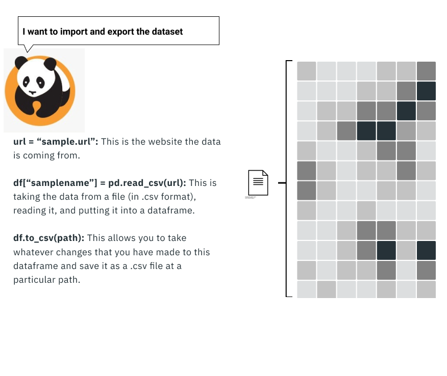
To even work with the data requires you first to import the data into Python. This process is usually as simple as a line or two of code, but this is only part of what you have to do to start with: you then need to check how the data is formatted.
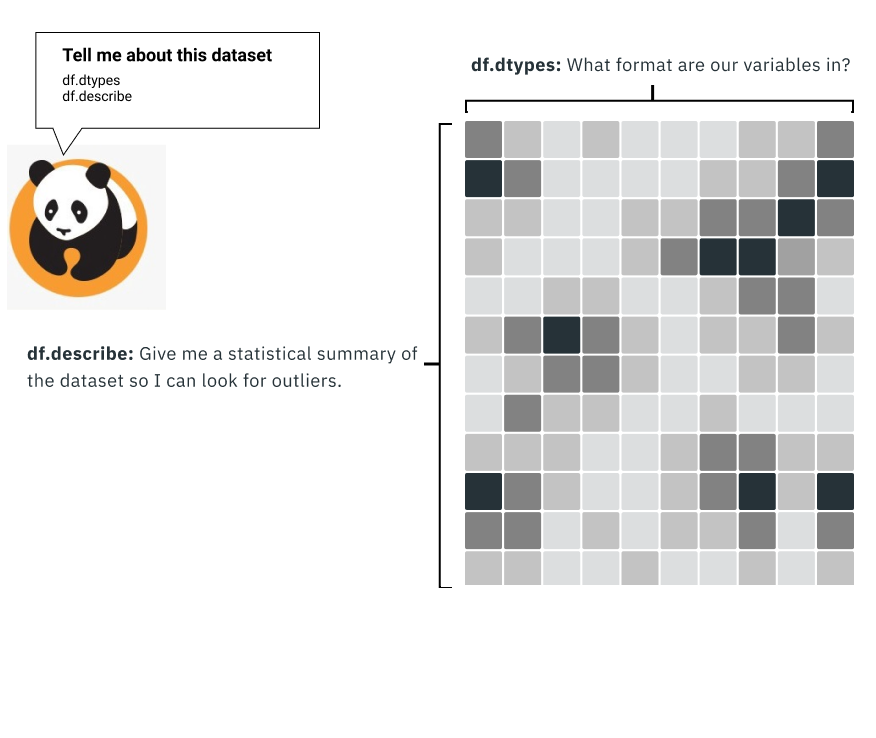
Data Formatting: Checking the data types
Programming languages like Python read data slightly differently than we do: they read everything quickly row by row and column by column, rather than skimming or jumping around.
But sometimes, the data you receive is in the wrong format for several reasons. This may not seem that bad at first, but it can have catastrophic consequences if you’re not careful.
For example, if we formatted a column only to contain whole numbers (called int), a value that might be $1.4 million in sales might round down to $1 million.
This means that any calculations done with this value are going to be wrong by $400,000.
So one of the first things to do is check if each column is what you expect. For example, rankings will be whole numbers, location is going to be a string of text, and the average of something may involve decimal places.
We can then do a quick statistical analysis with a single line of code. This allows us to check to see if anything is out of place quickly: if the average age of participants is 315, for example, then you might have errors you need to fix.
At this point, it may seem like this is less efficient than something like Excel. But the next thing on the data cleaning checklist is one of the things that makes Python so useful: identifying and handling missing values.
Dealing with missing variables
Not every dataset will have a 100% response: many factors (like errors or people skipping questions) result in real-world datasets missing data.
Because the missing data can occur because of several factors, there are several different approaches that you can take as a result.
Check the data source:
One of the simplest things is often to trace back to the data source and see if there are additional data sources, columns, or other things that you can use to fill in the gaps. Most of the time, a source is provided along with a dataset to validate that this is a reliable source of data and if you want to use supplemental datasets for more information.
Drop rows or columns missing values:
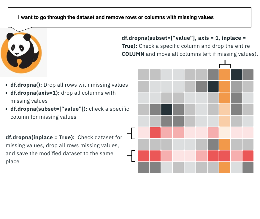
Another method that you can do is to drop the missing row or column.
If you have 10,000 rows of data, it doesn’t hurt to drop 50 or so rows of problematic data because of missing values.
The other approach, in this case, is to drop the entire column. This can be a little extreme as you’re often getting rid of a variable in the dataset, but you can take this approach if there’s too much missing data.
Replace the missing variable:
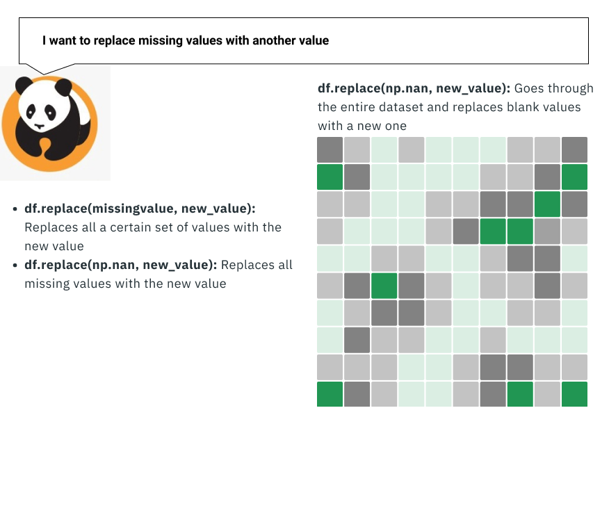
This is often a better, albeit a little bit trickier, approach to the data. You can take all the missing values and replace them with another value. This is usually done when the variable is something that you calculate (like the average amount of time on a page) so that these values don’t affect the calculation.
As a result, the value that you replace things with typically tends to be the mean of the existing column.
Leave it as missing data (in a workable format):
Lastly, you can consider leaving the data missing if certain reasons leave it as it is. For example, if you’re trying to count something by the number of unique IDs (like how many times we selected certain values), perhaps none of these approaches would work for you.
In this case, you would need to get the data in a workable format. This may include using things such as “N/a,” “0”, or blanks to occupy these values. It may be a little complicated to work with the data with additional steps in Python, but there are workarounds for this.
In addition to this, Python is also very good at making large-scale data changes, which can often be necessary in some cases.
Data Formatting
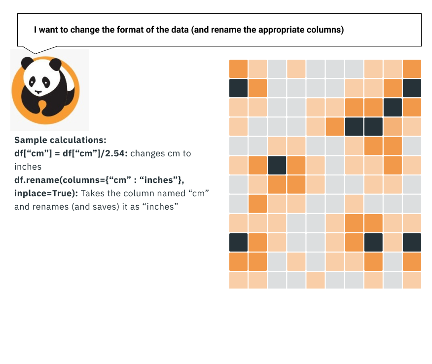
If we’re going to be basing any calculations or decisions on the dataset, we have to make sure that it’s in the format that everyone expects.
This is something that largely affects datasets that may involve things such as demographic data. For example, some of the most common inconsistencies around format include Dates (04/14/2020), Height (inches vs. Cm), Weight (lbs vs. kg), Time (AM/PM vs. 24 hr), and so forth.
This is also when you might want to think about your audience: which format you want to convert your data to will depend on what your audience is used to (for example, you wouldn’t use cm for a largely American audience).
It may sound like a silly thing, but NASA has lost a Spacecraft because someone failed to use the right units.
Why bother with data quality in the first place?
If you’ve followed this article up until now, you may be wondering why you spend this much time worrying about data quality so much.
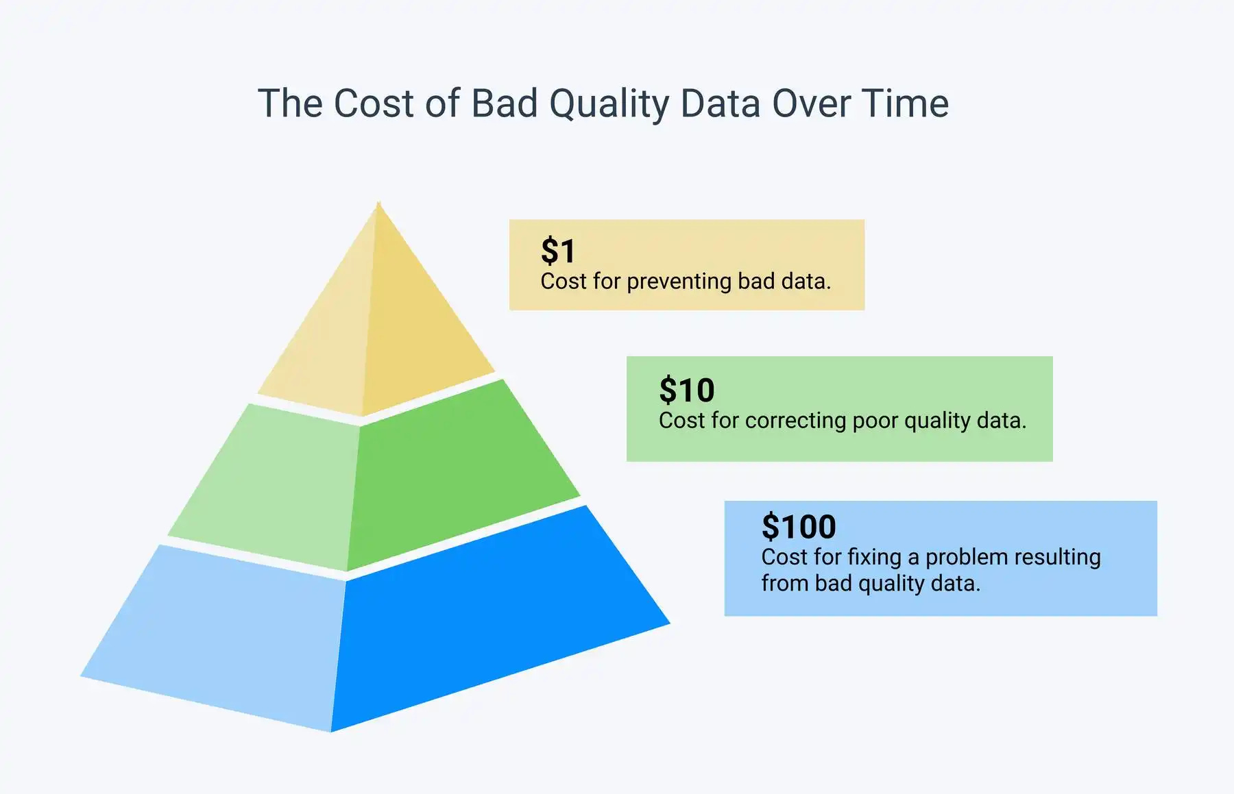
To answer this, let’s look at an often-cited statistic about UX: fixing a problem in development cost 10x as much as fixing it in design, and 100x as much if you’re fixing the problem when the product has already been released.
Whether or not these are the exact numbers that are still applicable, I bring this up because this type of model also applies to Data quality.
https://monkeylearn.com/data-cleaning/
We often don’t think about it too much, but working with poorly formatted data can yield many problems if not caught early on enough.
We can base our design decisions and what we present to our stakeholders based on what data we collect. For example, if we only interview 5 people, and two of them give us faulty data (for example, they’ve only observed others working on a program and haven’t used it themselves), then the conclusions we draw from that user test might be flawed.
So making sure that the quality of the data remains high, even as you scale up towards working with more users, can help prevent you from drawing the wrong conclusions.
So if you’ve ever experienced a tedious afternoon inputting and correcting a large spreadsheet of user data, consider learning less than 100 lines of code. Learning just that little bit can save you hours of headache.
Kai Wong is a UX Designer, Author, and Data Visualization advocate. His latest book, Data Persuasion, talks about learning Data Visualization from a Designer’s perspective and how UX can benefit Data Visualization.