


How a simple design decision can result in hours of data wrangling
The impact UX can have on Data Science


Photo by Mike Lewis HeadSmart Media on Unsplash
Creating structured data is an essential part of making sure that you have a usable and accurate dataset.
Being able to make sure you have a clear idea of what metrics you want ahead of time, along with how you’re going to get and test for those metrics, plays a large part in making sure the data that you collect is accurate and usable. This can be seen through the type of visualizations that Data Scientists are creating: both are integral parts of Data Science, and reliant on high-quality data.
But the real world doesn’t always provide such high-quality datasets, which is unfortunate.
I said before that I would revisit this quote in a previous section:
Data-aware Design can reduce Data Wrangling.
Coming from UX, I found something interesting when doing Data Science work: it seemed like UX could help solve this problem. So I’d revise it as this quote:
UX can help reduce data-wrangling with data-aware design.
To illustrate this, let’s go back and revisit the concept of data-aware design.
Data-aware design
There’s a famous quote from usability that goes like this:
“Fixing a project after deployment costs 100x more than fixing it in design.”[1]
Put, designing a system well in the first place can save you the time and effort it would cost you to fix a faulty system after you’ve deployed it continually.
And that mantra is core to data-aware design. Suppose you don’t spend time thinking about what data you need to collect or what metrics would help capture ahead of time. In that case, the data team will receive flawed or incomplete data that they then have to spend additional time doing data wrangling.
In that way, the previous two sections, about metrics you’re interested in and forming a hypothesis, make sure that you’re testing for relevant metrics that your stakeholders care about and making sure we can properly define if something was successful or not.
As a result, we can have an idea of how we want to approach setting up a study.
However, that isn’t the entire picture. After figuring these things out, the next step is actually to design the study.
And when we do this, we need to understand how small changes make a massive difference in the data structure.
Reducing Data Wrangling through design
To begin with, what is structured data?
It is data that has been structured in a certain way to allow data scientists to ask questions of it and have it return answers.
As UX professionals, we often design questions, forms, or other fields that generate the data that Data Scientists work with.
This means the design decisions we make often impact how structured the data is by default. For example, if we designed a State field just large enough for abbreviation, we’d get primarily structured data.

But what might happen if you elongated this field? Well, then it might prompt a range of responses, which would result in less consistently formatted data.

This would result in the Data Scientist having to do what’s called Data wrangling[2]: this is the act of gathering, transforming, or formatting the data into that structured format for queries.
In this case, they might have to run several queries to clean up the data into a usable format.
For example, they might have to create a query to separate words into strings by space (” New York” —> “New” “York”) and then abbreviate each string to just the first letter (” New” “York” —> “N” “Y”) to get everything to mostly the same format.
Then they might have to run another query that would scan the entire column for specific values and standardize them (if the string has “N” and “Y”, then replace that with “NY”).
And this is just for a small change, like the length of the state box.
As the amount of data starts to scale, this quickly becomes a necessary and tedious process that can take up most of a Data Scientist’s time. By some estimates, this process takes up to 80% of a Data Scientist’s workday.
When you have 1000 or 10,000 results, you have to do data wrangling to run any queries at all. After all, there’s no sense in building models on data that is either formatted incorrectly or is plain wrong.
And I got to see the effect a small design decision made when I worked on a data science project.
What might have been a 5-minute design decision resulted in a 10-hour data-wrangling session to address a problem.
And the whole time, I was thinking about how a single change in the UX Design could have made this process a lot easier.
A sample Data Science question
“Which neighborhood should I prioritize for my injury collision safety initiative?”
That was the question that I was trying to answer for a data science capstone project.
I had determined through visualization that I needed to probably focus on the Downtown Seattle area, as that was where a large number of accident collisions were happening.
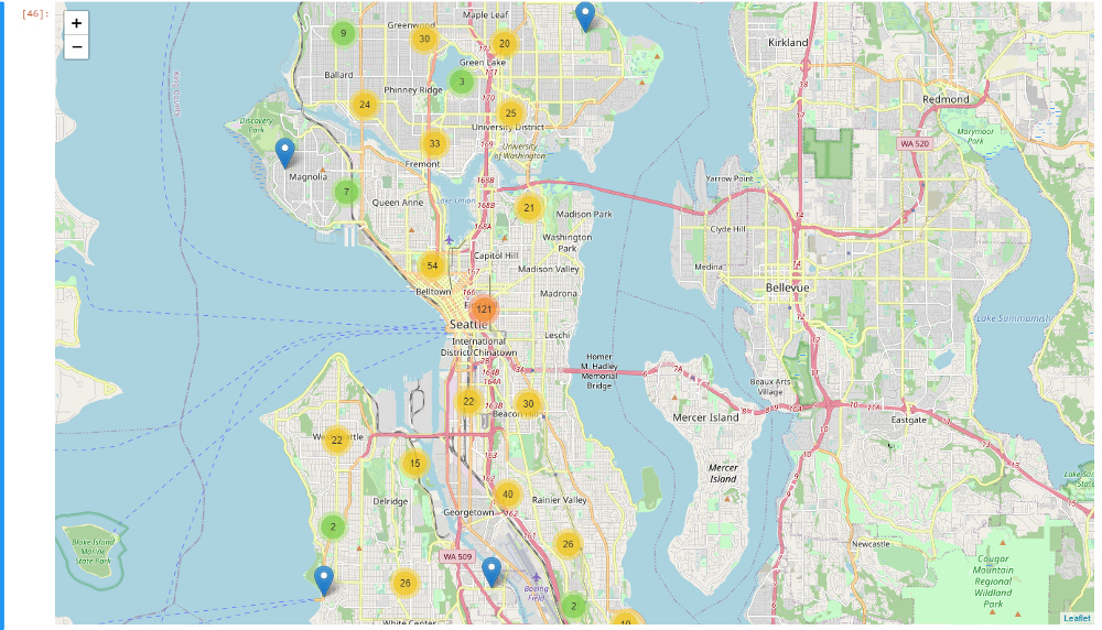
Seattle accident collision visualization
Through some more data analysis, I found that the types of accidents most likely to injure people were collisions between one vehicle and either a pedestrian or cyclist.
But the problem became more complicated when I realized the number of different neighborhoods in that area.

Github visualization of Seattle neighborhoods[3]
If I could only choose one neighborhood to prioritize, I needed to rely on location data generated with these accidents.
But the only location data that I had was either latitude/longitude data or disorganized street data.
Which meant I had roughly 200,000 rows of these two options:
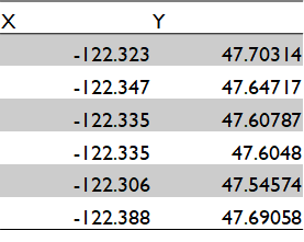
Structured Latitude/longitude Data

Less structured Location data
I ended up having to manually create boundaries that represented the multiple dimensions of latitude and longitude for each neighborhood to check whether the latitude and longitude fell into a specific neighborhood, which was an incredibly tedious process.
I’m sure that more experienced data scientists could get this to work in less time (probably using ArcGIS, which I couldn’t get to run), but as I was still learning Data Science, this was the only solution I could come up with.
But all I could think about, as I was spending hours or transform and clean this data set, was a single thought:
Our users could have answered this question.
The cost of a missing data field
The UX designer in me immediately thought about who our users had been that had generated this dataset.
Since this was a dataset about accident collisions within Seattle, the users filling out these accident reports were likely emergency services or police. When I thought of that, I couldn’t understand why this data field had been neglected.
Police, for example, have specific routes and neighborhoods that they patrol, and they’d likely be able to answer which district an accident occurred at. So something as simple as adding a single data field regarding neighborhood would have solved this problem.
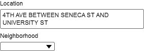
Asking for neighborhood data
But let’s say they’re in an unfamiliar neighborhood or are not sure which of two adjacent neighborhoods they’re in. We could have then added another automatically generated field to assist, then.
Given that the report’s latitude and longitude are almost certainly automatically generated (as there’s no way a user would know this), it doesn’t seem that far-fetched to generate the police precinct that this falls into as well.
Or, perhaps a simple map of the neighborhood could be included, with numbers corresponding to the area.

Doing any of these options would have allowed me to answer this question quickly.
But because no one realized that this data field was something people would care about, I had to gather data from other sources and spend hours transforming the dataset into something that would answer my question.
Your design details matter more than you realize
Until this point, I’ve been talking about all of the things that I’ve learned from data science, but going through a data science project made me realize what design can offer data science.
It can be not easy to see the type of impact that your actions make in the moment, especially on the design side.
But the choices that you make can often have long-lasting effects, especially if you’re going to collect a lot of data.
So how can you design fields that will yield the right data?
Reach out to your data team members.
Whether it’s Business Analysts working with Business Intelligence or Data Analysts dealing with data, they can tell you the most challenging part of their data-wrangling process and if they need more information for specific fields.
Just hearing about the struggles with data that they might have with data formatting can give you ideas of how you can make minute data adjustments to input fields or structure.
From there, it’s in your hands: your best practices in design will often yield data that can be useful for powerful insights.