


Hands-on Visualization practice: #MakeoverMonday week 2


My Revised version of 11.01.2021 Data.world dataset
This week, the dataset (and visualization) was based on a UNICEF chart showcasing the gender disparities regarding Adolescent HIV in Sub-saharan Africa.
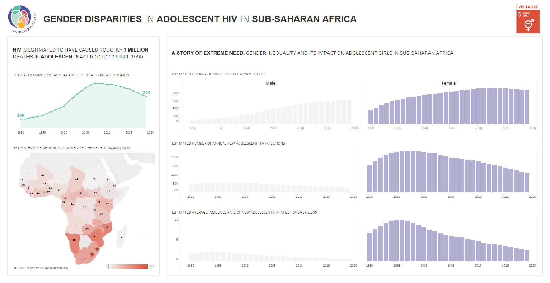
The original visualization for 11.01.2021
What works and doesn't work here?
The enclosed dataset has several strong points, with several visualizations. However, one of the problems is that the information hierarchy is a little weak: the chart can draw the user's attention to a dozen different places. Between bolded text, colors in graphics, and icons, it's hard to tell the most important point of the graphic and where the user should start.
Also, there are many different color schemes in play here, making it seem like these charts are unrelated and assembled from a collection of possible sources. The borders also suggest two different charts, which means that perhaps these did come from two different sources.
There is also the matter of scale: the side of the chart by the side seems to indicate they are roughly the same numbers when they are super far apart. While the point of this chart is to emphasize the female side of things, it does this by de-emphasizing (and separating) the male side of the chart, to the point where a comparison between the sexes is very hard.
Lastly, many of the points that one is trying to make with the chart are not labeled on the chart but with the heading. Simple things like pointing out specific points, indicating points of interest, or zooming into what is relevant here need to be examined.
What did I do?
I started by making the charts into one consistent color scheme based on the purple background of the logo. By doing this, we can see that the charts are related. This also comes into play when it comes to hinting at the interactivity of the chart.
I then did what some might consider a controversial design choice: I removed the scales from all of the charts. When I read over the point the text was making, I did this because it seemed like the absolute numbers were secondary. The primary point of the graph was to show the disparity between females and Male when it came to different categories, such as # of annual HIV deaths or new HIV infections. For that reason, it was important to spend time emphasizing the difference between the categories, even if the scales weren't immediately comparable. I did, however, include the values of the chart as a tooltip.
I then added another value, Average incidence rates per 1000 people, to turn a number into a percentage. Doing this saves users an extra step in calculating the percentage of the population affected (50% instead of 500/1000 people).
Lastly, I created interactivity based on the country map: rather than using labels and hard to read color scale, I tied the charts displayed to the right to the country selected. When nothing is selected, it shows the total across all available data. However, when a specific country is selected, the charts change to showcase all available data regarding a specific country.
What would I do next?
One of the next things I would try and tackle would be to incorporate these charts to eliminate the years. It seems excessive that I require years on all 4 of the sub-charts, but I could not come up with a way to eliminate them in my allotted time.
The next thing I would try and do is play around with some experimental charts, such as bubble charts, to represent the average incidence per 1000. Bubble charts look a lot like a virus, and seeing it change over the years can evoke strong imagery (even if it does appear a little unreadable).
Lastly, I would try and figure out a better way of arranging space: it seems like I could save a lot of space by eliminating excessive things (such as parts of Europe on the map, the year axes, and titles). Doing so would allow me to present data in a cleaner format.