


What works and doesn’t work with this chart?
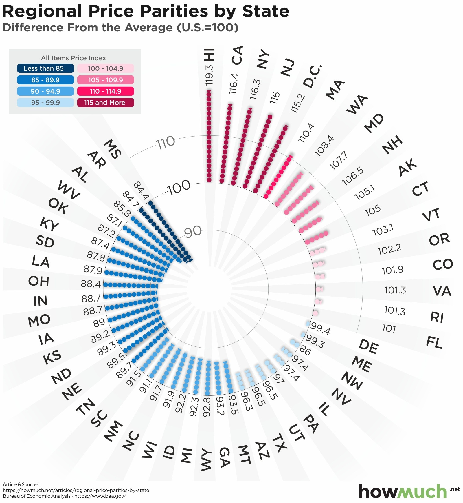
This is a beautiful visual that showcases how things are more or less expensive by state. It has a lot of interesting aspects, including a beautiful color palette and eye-catching design.
The main problem with it is it’s incredibly hard to read for a number of reasons. First things first, the measures that it uses simply don’t make sense: while it could be argued that the highest values have the longest length bars, the lowest values shouldn’t be: even following the weird circular tick marks, values in the 80s shouldn’t be reaching to the 100% line. It takes the reader a moment to understand the length of the red bar above 100 is for states above the average, while the length of the blue bar below 100 is how much less it is than 100.
But there’s another fundamental problem with the way it’s structured: it’s hard to find what you probably came here for. One of the main reasons a reader would read this is to find out how their state compares to the national average. Not only is the chart ordered in a strange way, it’s also hard to read a curved structure and find your state. As an example, image you’re trying to find Georgia (GA), Montana (MT), or Wyoming (WY).
How can you make this better?
The simplest way to address this is to use a map. Doing a specific choropleth with a divergent color scheme was one of the easiest things to do. However, I was short on time to further improve this, but there were a couple of other things I would probably do if I had more time.
The first would be to make this into a hex-tile map. It can be hard to deal with the differences in size of states (i.e. the Alaska effect) and being able to identify some of the states on the east coast.
The other thing that I might want to do is spend more time thinking about the categories of data. This would require more effort into understanding what are good breakdowns of what categories are best suited towards something.