Get better at using color palettes with choropleth maps
The intensive and creative way to practice with color palettes.
We often don’t get the chance to practice working with custom color palettes as UX Designers. There’s often company branding or a style guide that guides many of our color choices, which means we don’t have much chance to work with color palettes and gradients.
However, a popular data visualization can help you practice working with these color concepts more effectively: Choropleth maps. You’ve probably seen some (or even made some) without knowing the actual name of it.
https://towardsdatascience.com/how-to-create-outstanding-custom-choropleth-maps-with-plotly-and-dash-49ac918a5f05
But creating a good choropleth map requires a strong understanding of how color can affect a reader’s perception of data. But to get started, we first need to talk about starting with choropleth maps.
What are choropleth maps used for
It may be tempting to say that any data involving geography should involve creating a choropleth map, but that’s not quite right.
We can only use choropleth maps when we want to understand patterns with geographic data. The main reason for this is because choropleth maps work best when using a single variable. For example, a single variable, such as income, is encoded into color and then plotted against the fixed variable of geography to see how much money different regions, states, or countries make.
Source: https://clauswilke.com/dataviz/geospatial-data.html
If we wanted to have both income and education on the map, though, we’d either have used a different chart or create a dual-axis map, which makes things more complicated.
https://thevizioneer.blogspot.com/2014/04/day-3-dual-axis-maps-filled-and-points.html
As a result of this, almost all of the data you want your reader to understand with a choropleth map has to be encoded through color.
One of the greatest strengths of choropleth maps is to see big picture differences between cities, states, or even countries, which means visually representing large amounts of data succinctly. But doing so in a manner that doesn’t mislead a reader requires practicing with color gradients and palettes.
And to do so, we first need to start with a single question: What sort of message am I trying to convey?
Understanding color palettes for choropleth maps
While all visualizations require some thinking about the message, you’re trying to convey, understanding that message is crucial to choosing a color palette for choropleth maps.
The color palettes used in choropleth maps tend to be one of three types:
Sequential
Diverging
Qualitative/Categorical
Deciding what type of color palette you’ll use is based on the message you’re trying to tell. For example, if you want to try attention to particularly high values, such as high poverty or crime rates, you would consider a sequential color scheme.
To show extremes, such as votes for two competing parties, you would consider a diverging scheme.
I won’t talk too much about categorical color palettes (i.e., each color responds to a different value) except to consider limiting the colors to 3 so that the reader can remember them easily. However, the number of colors you consider for your choropleth map also affects how users interpret data.
Understanding how the number of colors affects data
A common best practice for choropleth maps is to use between 3–7 data classes. But keep in mind that the number of data classes can easily affect how the reader perceives data.
https://www.vis4.net/blog/2011/12/choropleth-maps/
So how do you determine how many classes to include? The technical method is to play around with different classification methods, like quantiles, equal intervals, and natural breaks.
https://www.axismaps.com/guide/choropleth
But there’s an easier way for designers to use our strengths and evaluate them based on visual clarity.
Evaluating through your own experiences with color can allow us to tell what works and doesn’t and can offer hints on how we might need to adjust things. However, there’s one other thing we need to consider as we do this: being able to perceive different colors within context.
Understanding visual perception and context
In a previous piece, I talked about how some color decisions in a vacuum are okay, only to run into issues when displayed.
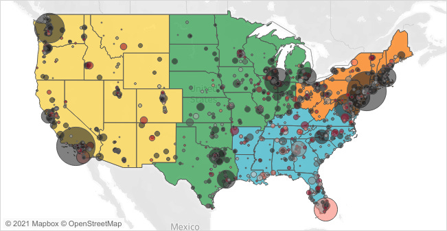
Source: https://public.tableau.com/en-us/gallery/where-elephants-go?tab=viz-of-the-day&type=viz-of-the-day
This applies doubly so when thinking about the complexity of choropleth maps. For example, a color scheme might work on paper, but it can just be hard to look at when put into context.
Source: https://www.censusscope.org/us/map_unmarried.html
This is something that we can easily evaluate when considering the visualization. Still, you’d be surprised how many people create color palettes without considering how they might appear within the map. And practicing with this visualization might yield a lot of progress for your design skills.
Getting practice and learning data
Choropleth maps are popular enough that you will probably create one if you work with data long enough. But even if you wouldn’t normally, it’s a great way to practice using color effectively. Understanding how to create a color palette, but create one when the visuals may not be completely consistent as you might normally expect, is a way to level up your skill using color quickly.
(As a side note, if you make choropleth maps, please make them of a different location other than the US).
So if you want a chance to practice working with color palettes, consider practicing with choropleth maps. It can level up your design skills.
Kai Wong is a UX Designer, Author, and Data Visualization advocate. His latest book, Data Persuasion, talks about learning Data Visualization from a Designer’s perspective and how UX can benefit Data Visualization.


