


Don't fear metrics: they offer amazing benefits if you can tolerate them
3 critical reasons why Designers should know a bit about metrics

This article was adapted from my latest book, Data Informed UX Design. To read more in-depth, I’ve provided a discount code with the above link.

Source: Photo by Negative Space: https://www.pexels.com/photo/macbook-pro-on-brown-table-139387/
One of my more controversial opinions, that time again I find myself dealing, is that UX designers should learn a bit about Data. In case you don’t know, I’ve written two books, started this newsletter, and have had a career working with both data and UX at this point.
For many designers, Data is unfamiliar, anxiety-inducing, and often feels like a thing that will kill any design creativity you might have. Unfortunately, none of these is more often the case than with metrics.
Metrics, for many people, are how businesses remove user empathy by reducing their users to a single number. For example, actuaries can plug in some values and calculate the monetary cost of human life so businesses can pay families in case a worker dies. It sounds cruel and the antithesis of what design should be about.
However, metrics are an essential tool to have in your designer toolkit, specifically for three reasons:
It’s a quick way to get an overview of the entire product and point you in the right direction.
It’s a fantastic tool for persuasion and communication, which means you can use them to persuade your team by speaking a language they know.
Only paying attention to a few “UX Metrics” can provide additional layers of depth to your user research.
Let’s check each one.
Metrics are quick Birds’-eye view.
How would you know if you succeeded with a website redesign six months later?
You might be on another project, perhaps even working with another company. So how do you know if your redesign made a difference? Often, the quickest way to do so is to look at Metrics. Metrics are a tool that many people, from CEOs to business analysts and developers, use to quickly see how things are going, how the overall picture is, and if anything’s going wrong.

Photo by Lukas Blazek on Unsplash
As a result, it can provide you with that zoomed-out view that you might need to understand how things are going. Of course, metrics are no replacement for user research: they can only tell you what users are doing, not why. However, they can shine the spotlight on places where you might want to do further research or give you a general sense of whether things improved or not.
For example, suppose there was a gradual increase in the number of users, a reduction in the number of drop-offs, or more users turning into customers that started when your redesign went live. In that case, you might have a solid idea that perhaps your redesign was effective. But you still might want to supplement that with additional data, such as user interviews, if you were to present your findings to stakeholders.
Understanding this Birdseye view also helps you tackle one of your most challenging jobs as a designer: communicating and persuading team members to follow your recommendations.
Metrics are persuasive and familiar to your team.
Have you ever encountered a business decision that you know is poor UX?
For example, the product owner wants to use a dark pattern, such as forcing users to put in credit card information for the free trial and billing them annually when the trial ends to increase revenue. However, this may result in users suddenly getting charged hundreds of dollars, which users may not have available.
How might you argue against that sort of dark pattern? Well, if you interviewed users, you might be able to point out certain things like user frustrations. But sometimes, that’s not enough: I’ve been on teams where users complaining are just seen as ignorant individuals, or this sort of change is a temporary road bump.
But what if you could build the case through hard data to convince your team that this was a bad idea? Then, you have a greater chance of succeeding. Whether you like it or not, many businesses follow the “data-driven” model, where they have confidence and make decisions based on what the Data shows them. This means that it’s often more persuasive and easier to communicate when you use hard data and user interviews to show why this pattern is a bad idea.
For example, metrics might show that a more significant number of people are abandoning your site when they get to the pricing page. You might also be able to look at specific other metrics, such as customer survey data or the net promoter score (NPS). When you combine that with user interviews with key people, such as the customer support team, who might’ve seen a spike in the number of customer complaints, tickets, and cancellations, you might have a solid case for how wrong the decision was and what’s necessary to reverse it.
And if you think I’m being optimistic, let me tell you about one of the metrics I mentioned. Businesses often spend millions of dollars to ensure that one metric, the net promoter score, is positive. So if you show them that the NPS dropped by 10 points, you’re going to turn heads and cause them to fix the problem.
However, does this mean you have to take business analyst courses and fully understand customer engagement, CX, and a whole other field? No. You only need to know a few UX metrics and implement them to add depth to your user research and help address any questions you might have.
UX metrics and analytics adds depth to user research
So one of the first things I must do is explain what I mean by Analytics and UX metrics.
Analytics are things you can collect before you start your UX process: these are statistics and data collected from the users on how they currently use the existing website or product. So, for example, you can see the average amount of time users spend on your website design right now.
On the other hand, UX metrics are things you can include or measure in your user testing to provide additional depth. They are most valuable when you can define your research question and what you hope to change or improve.
For example, analytics can tell many users drop off when they get to your checkout page. They can’t tell you why that’s the case, though. That’s why you might want to set up user testing regarding checking out the task to see what’s happening. However, you also might want to capture some UX metrics, like error rate, during the testing to help add additional depth to your user test.
But you don’t need to know that many UX metrics and analytics: frequently, there are only that you need to pay attention to.
So here’s a list of 10 common analytics and UX metrics you might want to pay attention to. This is not a comprehensive list, and I go into more detail in my book on data-informed UX design, but it’s a starting place.
Three Questions analytics can answer.
Do our personas match our analytics data?
In Google Analytics, you can check information about your users, such as the typical age range, if they are new or existing users, how often they come to your site, and for how long. As a result, you can validate if your personas cover what the Data says.
Do users navigate the way we are hoping?
Google Analytics has a behavioral flow map that tells where users typically land on the page and their first, second, and third clicks.

If they land on different pages or do not navigate the way you intended, you might dig into why.
Where do most users click away or abandon your website?
It’s no surprise that sometimes, users leave your website for several reasons. However, if many users click away (i.e., a high bounce rate) at a specific place, that may be a place to start your user research.
These are some of the most common questions that analytics can answer, but there’s one other thing to pay attention to UX key performance indicators, KPIs.
7-8 UX Metrics to know
UX metrics are also commonly known as UX KPIs or key performance indicators. As I stated before, establishing your research goals and objectives is often necessary because it will help you determine which UX metrics you need.
For example, a website designed around the KPI of efficiency, where you’re trying to make the user click as few times as possible, will look much different than the website designed around the KPI of task completion. The latter website may have very detailed onboarding, contextual help, and other things to ensure that the user knows exactly what’s being done, while the former could be as simple as a plain text version of the website.
Here is a quick list of UX metrics you want to pay attention to.
Task success rate
this is a simple matter of talking about how many people can complete the tasks you set forth as part of your usability testing. It’s as simple as having your notetaker track how often users completed tasks and the total number of attempts to do something.
For example, if a user completed all four tasks of your testing, but task 3 took three tries to complete, you would divide 4 (total tasks) by 6 (1 + 1 + 3 + 1 attempts for all tasks) to get a 66% task success rate across all tasks.
this doesn’t just capture how users complete specific tasks: you can also illustrate the learnability of your site.
The user has to do a test multiple times throughout the testing. You can compare the progress between the first time you do something and subsequent times. This is an excellent metric for benchmarking: if on the first user test that you do, you have a test success rate of 50%, and that jumps to 75% with the second user test, you can show that you’re making things easier for users.
Search versus navigation:
This binary KPI sums up what percentage of users you search for and which use navigation. For the most part, you want users to use navigation such as the sidebar or top menu items. A high search percentage means your information hierarchy or menu labels might confuse users.
However, this might change on a case-by-case basis. For example, Amazon would want more users to use the search bar instead of navigation because it’s tough to find a specific product brand through navigation alone.
You need to know how many of your users chose which option and turn that into a percentage. For example, if 3/5 users use the navigation while 2/5 use the search, it would have a 60% navigation rate and a 40% s search rate.
Time on task:
This takes how long it takes users to complete specific tasks across all participants. So while Analytics may be able to tell you things like the average amount of time users spend on a site, they’re not always able to tell you how much time is spent On individual tasks.
You should set up your user testing to pick out the tasks most important to you. Then, if you can have a notetaker note the start and end times for each user task, you can calculate time on task and get some interesting insights from them.
However, this is one of those things where it’s less valuable and accurate to talk about averaging all these times across users. Talk about the correct way to talk about these below.
User error rate:
This comes in two flavors, error occurrence rate, and error rate. The difference between these two values is the number of potential errors on your page. The error occurrence rate is if the task only allows one potential error, such as users incorrectly typing their email address on the login page. In this case, you might say 2/5 users made this mistake, so you have a 40% error occurrence rate.
On the other hand, the error rate is when there are multiple errors potentially per task. For example, if there are potentially five errors that a user could make, you would want to count the number of mistakes each user made and divide that by the total number of potential mistakes.
For example, five users made the following number of errors: (2, 4, 1, 2, 3). So first, we would sum up the total errors, divide it by the total possible error opportunities, then multiply it by the number of users.
So in this case it would be: (2+4+1+2+3) (total errors) / (5 (total possible error opportunities) * 5 (Number of users)). This equals 12 / 25 or a 48% error rate.
Single ease question (SEQ):
This single question is asked after each task to assess how easy or difficult a user thought a task was. This ranges from one (very difficult) to seven (very easy). Again, this can be asked after each task to get a sense of which tasks may be harder or easier for users.

System usability scale (SUS):
A widely used tool for assessing perceived usability is a 10-question survey with a five-point scale that can quantify the perceived usability of your site into a specific number ranging from 0 to 100. Especially useful is Pairing this number with Other ways of describing things, such as letter grades or adjectives.
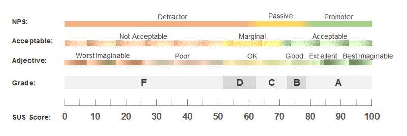
Few things are more effective for getting your team to concentrate on usability than telling them that you have a 51 SUS score, which translates to an “F.”
Net promoter score (NPS):
Net promoter score is incredibly effective but challenging for UX to use. This is because, unlike the other tricks above, NPS can’t be used with small sample size, like five users, without skewing incredibly wildly.
However, you can use a two-part question similar to the NPS that may yield interesting insights:
First, how satisfied were you with this website (1 to 10)?
Why did you give it a score of X?
In this way, you’re taking a number and getting the reasoning behind it. Of course, it doesn’t equate perfectly to NPS, but you can often get some interesting insights.
Knowing a little about metrics can offer you a great deal
You don’t have to know everything there is about metrics and analytics for it to have a significant impact on your UX process.
Being able to ask for a Google Analytics account and seeing useful metrics That help guide your UX process can be something that has a significant impact on how your organization perceives UX. We’re not just people who draw things and create mockups. We often put a lot of thought into how we design things, interactions, and more.
So being of the speed of your process, add layers of depth to your user research, and learn ways to persuade your team to follow specific design recommendations or why metrics can be helpful to add to your skill set.
So although you might still have some reservations around metrics, try to learn a little about them. You might find that it offers you a great deal more than you might’ve expected.
Kai Wong is a Senior UX Designer and a top Design Writer on Medium. His new book, Data-informed UX Design, explains small changes you can make regarding data to improve your UX Design process.