Are you boring your interviewer by over-explaining context?
How to use the power of narrative to engage interviewers with your design portfolio
I was reminded of a common mistake I used to make when I was recently mentoring junior designers with their portfolios.
For designers with only a few projects to their name, I know there’s a temptation to over-explain what you did on them in detail. Nothing might seem more awful than quickly summarizing your work and having nothing else to your name.
But you may make a critical mistake when you do that: you might provide too much background and context.
To explain why this is a problem, let me walk you through how I struggled to talk about one of my first design projects: a Gesture-based Interface for surgeons to coordinate during Laparoscopic Cholecystectomies.
You can never fully explain the context, and it’s better not to try
I’m pretty sure you have no idea what I just said in the sentence above. To adequately explain the context of that project, here are the questions I’d have to answer:
What is Laparoscopic Surgery, and how does it differ from regular surgery?
What is a Laparoscopic Cholecystectomy (i.e. Removing the gallbladder)?
How is the operating room set up for surgeons?
How many surgeons are in the operating room, and what is their role?
Why use gestures instead of other interfaces?
Why are there difficulties coordinating between surgeons?
Etc.
In other words, that might be like ten slides of explanation of the context before ever getting to what I did as a designer. That is the problem I struggled with, and it turns out that I wasn’t alone.
From over-explaining payer-provider portals to talking about the history of W3C for several pages, I’d see Junior Designer portfolios where they wouldn’t even begin to talk about what they did as a designer until the user scrolled the page 4–5 times.
While the fold may not exist anymore, forcing recruiters to read or scroll several times before seeing what you did isn’t helping you get hired.
So, you must first realize that you can only explain some of your context to your audience. When you do so, you can take the first step towards creating something more useful.
You need to simplify your problem to the level of an audience.
Provide an explanation your audience will understand
So, if my design project above was incomprehensible to the average person, what could I have done to fix it?
The simple fact is that you need to start where you always have: by understanding your audience. There are two significant audiences that you are targeting. The first is the recruiter, and the second is the interviewer.
Recruiters are (mostly) 3rd-parties contracted with your company to look for specific skills, experience, and more. Their goal is not to pick out the ideal candidate and hire them; they aim to thin out the applications to a certain number, which they can pass on. They’re not experts in design, nor are they looking to talk about the finer details of projects.
They want to know how you work and if you have experience in the skills the company is looking for. So, part of understanding this is that your project is going to be catered to one of two things:
What is your design process like?
Do you have experience with X skill, or how would you handle Y situation?
For example, a recruiter might ask, “Have you ever collaborated with your team on Figjam before?” If so, you don’t need to provide six pages of context to tell people about the project before answering. All they care about is the situation where you applied those skills.
Even if you’re working with interviewers who may ask you about your project in more detail, they’re not concerned about understanding the field you worked in. All they want to know is something like this:
“I’ve encountered X situation in this past experience before. Here are a few sentences of context around what the problem was, and then this is what I did.”
In other words, the context is meant to set up the problem rather than explaining where you worked before. We can rely on a pneumonic to ensure that you set up your problem in a way anyone can understand.
To simplify your problem, you need the HEART of a pirate (AARRR!)
The pneumonic above refers to two metrics frameworks that can simplify any complicated design problem you may face into goals people can understand.
The two frameworks are the Google HEART framework:
Happiness: How is user satisfaction? Are they finding it valuable/enjoyable?
Engagement: Are users actively using it? Are they returning regularly? What are they doing?
Adoption: How many new users start using the product?
Retention: How many users continue to use the product over time, which shows long-term value?
Task Completion: How efficiently/accurately can users complete specific tasks?
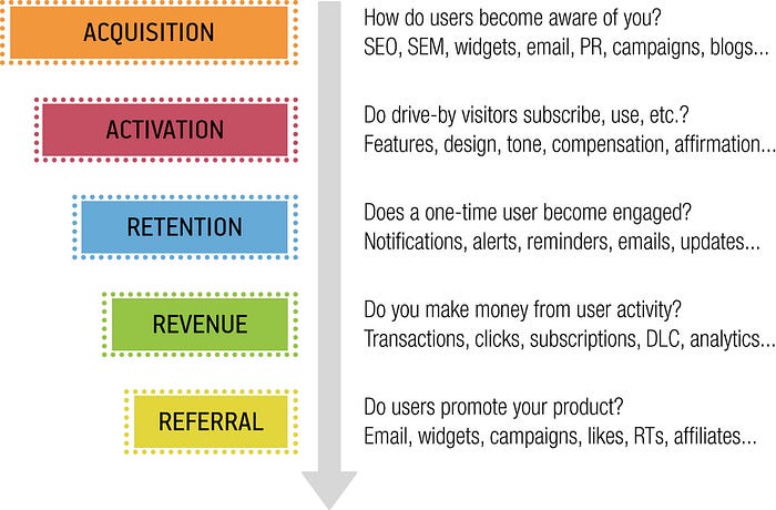
And Dave McClure’s Pirate metrics (AARRR):
Acquisition: How do users discover your product, or how aware are potential users of your product?
Activation: How do you ensure an initial positive experience with the product, including users effectively using your product after discovering it?
Retention: How do you keep your users engaged and returning for more?
Revenue: How do you engage users with the financial aspects of your product’s success (i.e., free to paid users, buying a product, etc.?)
Referral: How likely are your users to refer your product to others? How might they advertise your product to others?
Your problem, in general, likely touches on one of these ten issues. For example, my issue with Laparoscopic Cholecystectomy was an adoption/activation issue.
The problem was the communication breakdown in the operating room; we had built a potential solution. However, most of my user research and design work was focused on that first positive experience (and adoption).
Despite all the problems, doctors are resistant to technology change. After all, they’re operating on a patient: if the technology breaks down, someone’s life can be at risk.
The project was about creating that first positive experience, understanding the barriers to adoption, and designing a way for doctors to accomplish small-scale actions reliably without disrupting the operating room.
Understanding the core of the problem and how it relates to these ten goals can be one of the most critical steps of this process. However, there’s one other crucial part: providing just enough context.
Just enough context and crafting a hook
While explaining the core problem you’re trying to solve is critical, that’s not the only thing you have to do.
After all, it’s still possible to spend six pages focusing on the correct problem instead of your design process. This is where Data Storytelling and a narrative framework can help you.
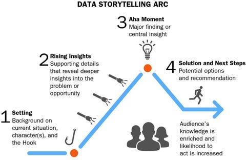
Brent Dykes, of Effective Data Storytelling highlights an ideal narrative arc for Data Stories that you can also apply to stories you tell around your portfolio.

The reason for this is simple: Data Stories are often focused on problem-solving, communicating key insights, and persuading your audience to take action. Those same skills are exactly what you need to talk through your design portfolio properly. You need to:
Set up the problem you had to solve on a portfolio piece
Communicate how you worked, what skills you applied, and what you discovered
Persuade the team, through these projects, that you’re the right person for the job
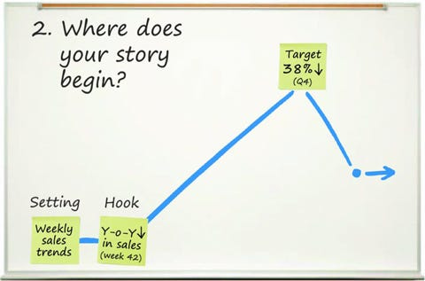
However, one of the critical parts of this narrative comes at the beginning: it’s the “Hook.” This is a concept that comes from journalism, where something is used that grabs your audience’s attention and interest.

It can be as simple as a catchy headline or engaging visual, but the Hook drives the narrative you tell around your project, not the context.
Therefore, you need to provide just enough context to address two significant things:
What is the (simplified) problem?
What is the Hook I want to drive my project’s story?
For my example, I might set up the context like this:
“Laparoscopic surgery, when done well, provides better patient outcomes, but it requires expert co-ordination between two surgeons. We developed a gesture-based interface to help reduce communication breakdowns we were observing, but surgeons initially didn’t want to use it.”
This highlights not only the problem (adoption/activation) but also your Hook: Surgeons didn’t want to use this. Specific questions, like “Why?” are raised in your audience’s head, which makes it easier to tell the rest of your story.
How you present your portfolio matters now more than ever
I know it’s a rocky job market for designers, especially on the Junior side. I have even had a couple of scares where I’ve needed to review my portfolio and think about how I’d showcase my work to others.
But one mistake I constantly see Junior Designers make is to trip at the very beginning of their portfolio.
Over-explaining context can be a prevalent mistake, especially to the detriment of what you did. It’s impossible to convey the context fully, but doing so often detracts from what people care about, how you work to solve problems, and how you apply your skills.
Instead, all you need to do is lay out the problem effectively, with a decent hook, to get people to understand where you’re coming from.
So, if you’re struggling to summarize your projects in your portfolio, consider if your introduction is too long. The quicker you’re able to jump into what your audience cares about, the more likely it is that your interviewers may be interested in talking with you.
I’m creating a Maven course on Data Informed UX Design! If you’re interested in learning (or would like to provide feedback), consider filling out this survey.
Kai Wong is a Senior Product Designer and Data and Design newsletter writer. His free book, The Resilient UX Professional, provides real-world advice to get your first UX job and advance your UX career.


